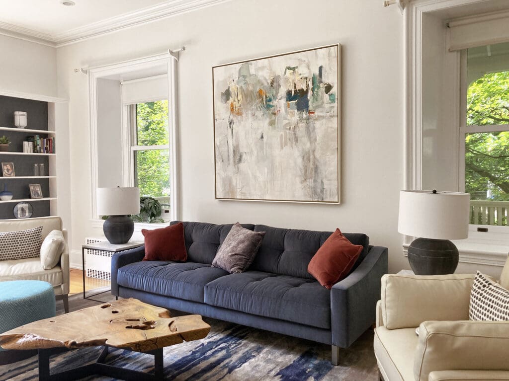
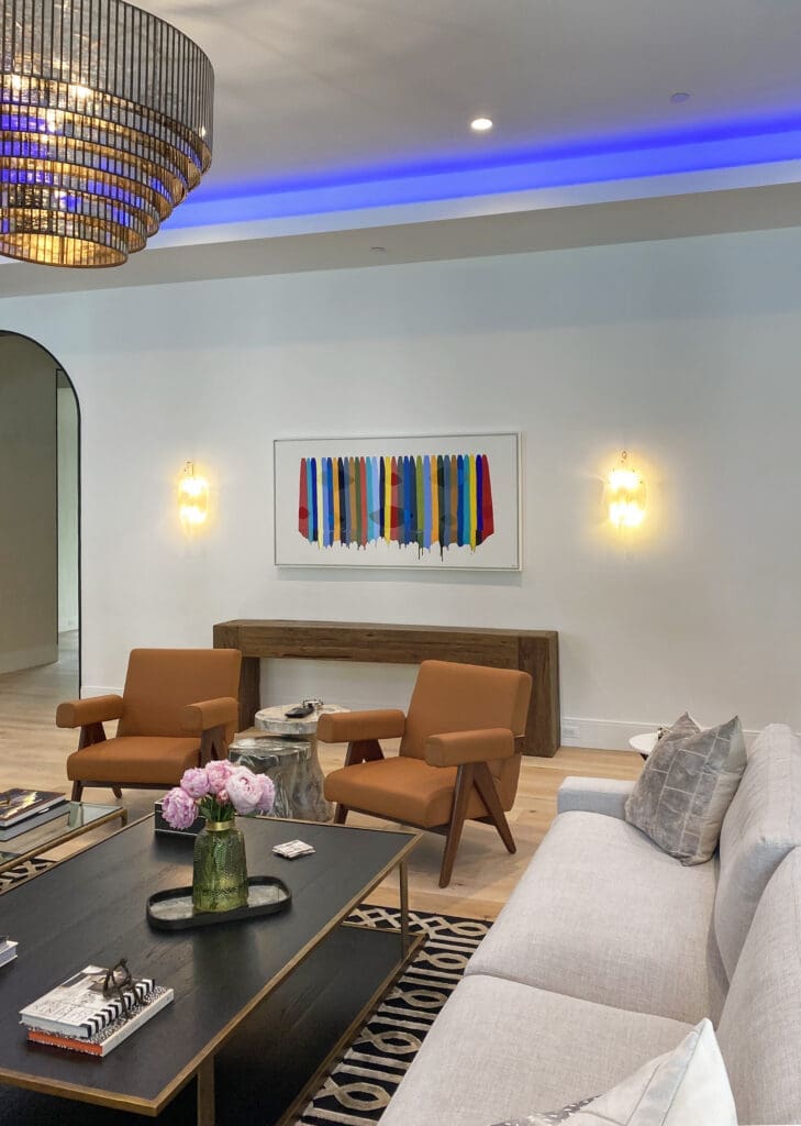
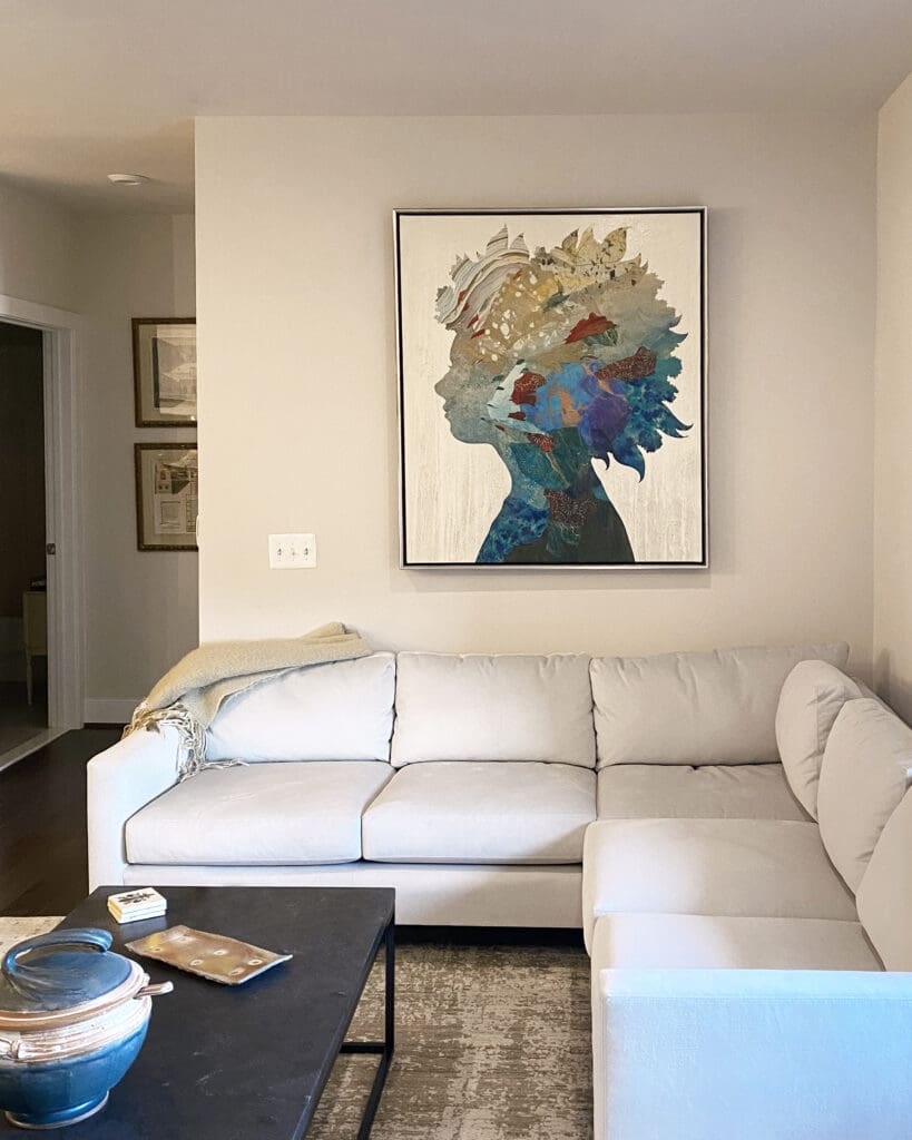
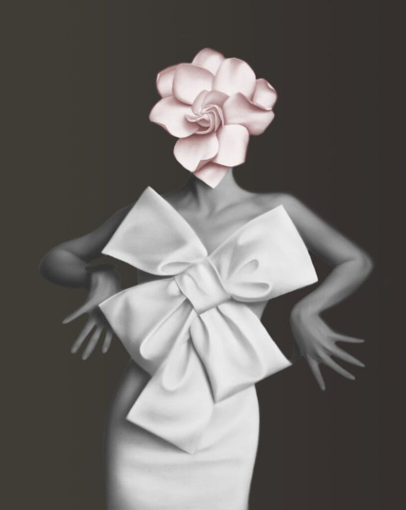
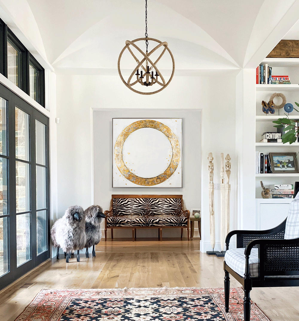
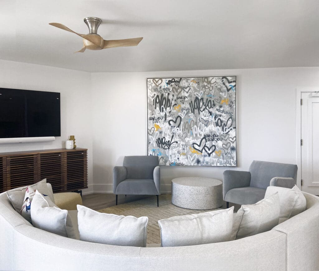
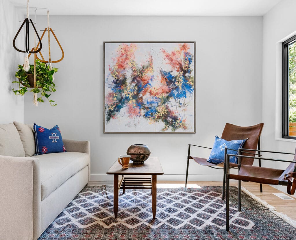
When striking contemporary art, flawless interior design, and professional photography come together, it’s just *chef’s kiss*. Check out these scroll-stopping spaces recently posted on Instagram that feature works from our galleries.
My role as an art consultant in the Haverford gallery is to educate and advise clients about the art, the artists, and how art will work in their homes or businesses. I feel the more background and detail a viewer has about a work of art, the more they will understand and appreciate what they are viewing. The consultants are the connection between the artist/art and the client.
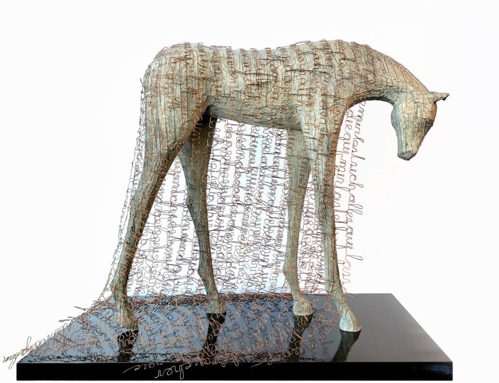
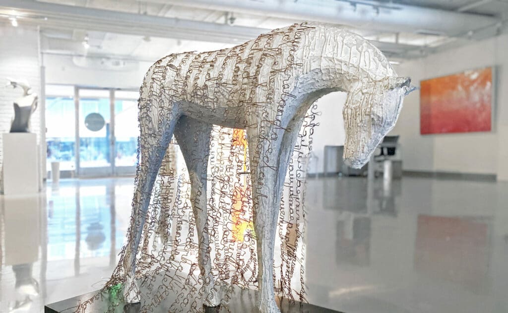
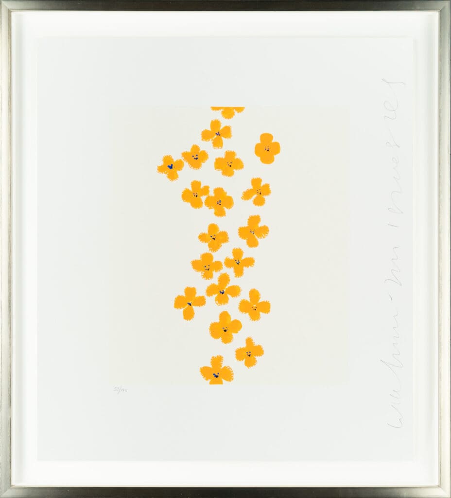
JD Hansen, Solo, Bronze, 28 x 32 x 11 inches
JD Hansen | Solo
Hansen’s sculptures have great strength while also conveying a vulnerability and tenderness. Solo the bronze horse stands in repose with head down, but at the same time this form is solid and regal. Hansen is able to show the majesty of the horse by its pose, elongated legs and strong posture. Hansen’s sculptures have a very timeless, classic quality, with a design that is still contemporary and stylish.
Rose Masterpol, Laguz, Oil and Acrylic on Canvas, 76 x 54 inches
Rose Masterpol | Laguz
Laguz is a Proto-Germanic name meaning “water” or “lake” as is evident in the strip of water that cuts through the painting. This orange dream vibrates on the canvas. It’s fresh and colorful, adding instant sunshine and good vibes to any space. This contemporary and modern abstract will give your home just the right amount of confident attitude.
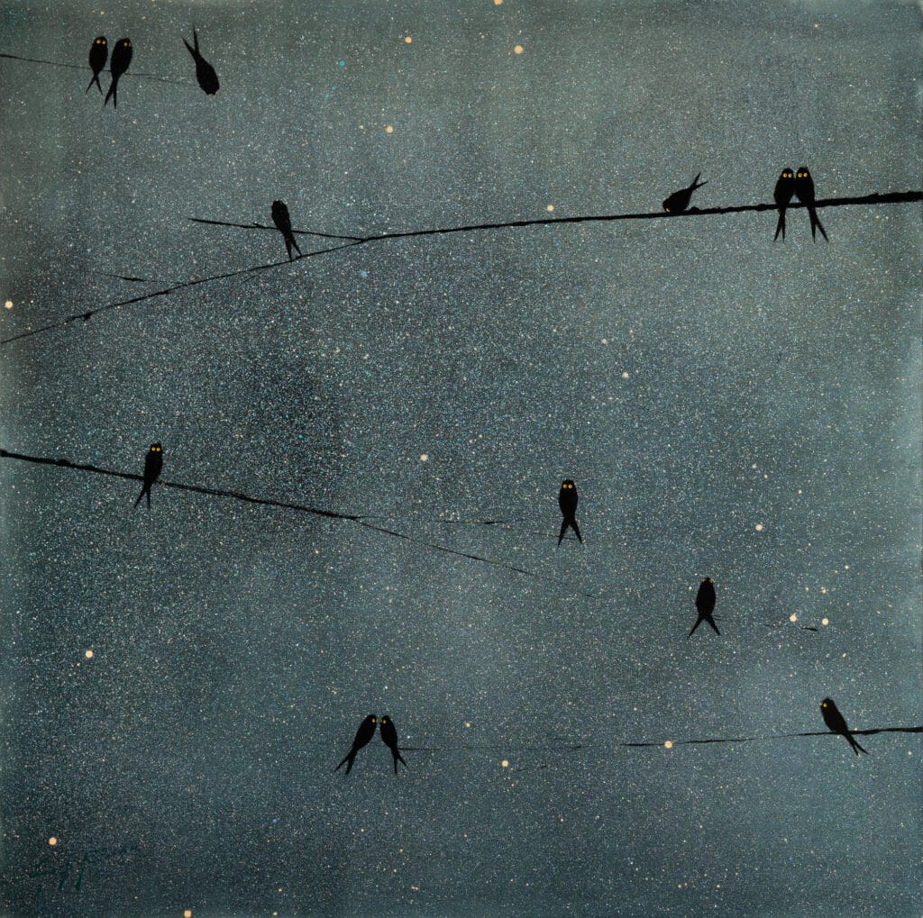
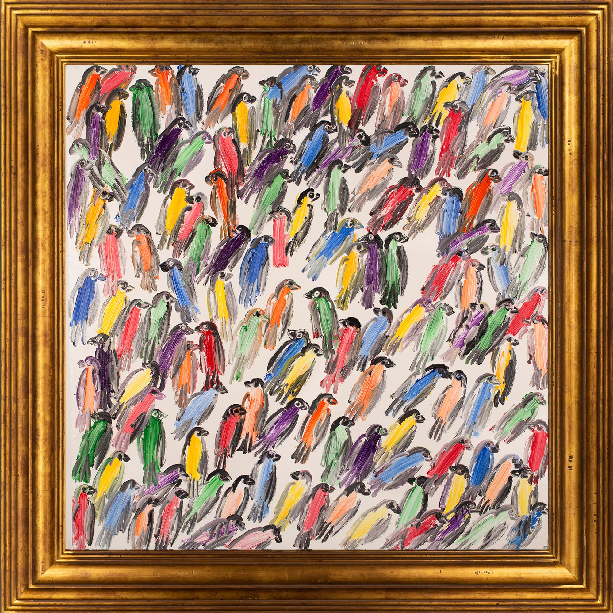
Hunt Slonem, Finches New View, Oil on Canvas, 30 x 30 inches
Hunt Slonem | Finches New View
Slonem has a remarkable way of celebrating the things we all know and love, as is evident in this fun and super colorful painting bursting with sweet little finches. You can just see the little birds chatting and gossiping, and the quick brushstrokes create an energy that captures the finches’ vibrant spirit. This painting will start many conversations, and also remind the viewer to embrace the fun in life.
When great artwork meets great design, you can expect some seriously swoon-worthy interiors. Browse these recent art installation shots from some of the talented interior designers we partner with.
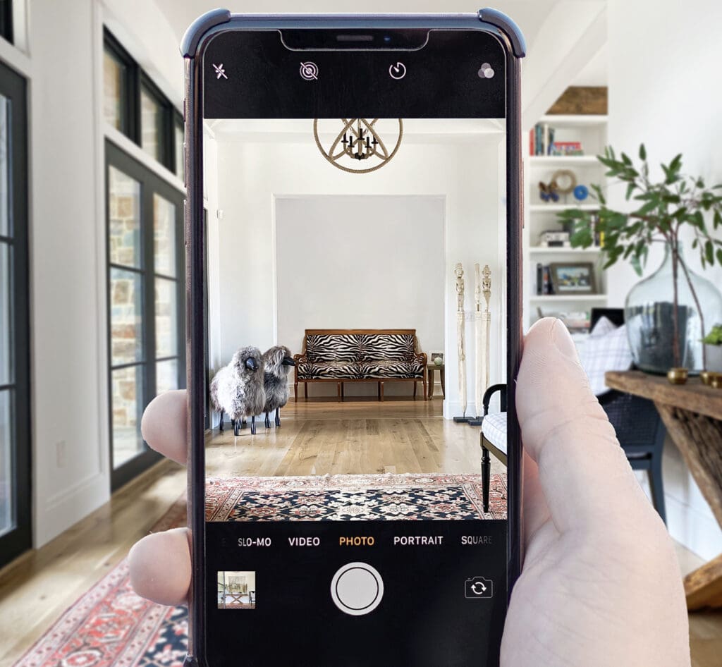
Did you know you can preview art in your home virtually? A virtual presentation is a great tool to view artwork in your home if you’re not local to one of our galleries, have a renovation in progress, or are just pressed for time. Follow these simple steps to get started:
Step 1: Browse the collection
Browse our diverse collection of artwork online or in the gallery. From our website, you can search by Artist and filter by style, size, shape, or color. We’re happy to offer an art consultation in-person or over email, phone, or Zoom.
Step 2: Send us a photo of your room.
Send your photo to inquiry@merrittgallery.com along with a few measurements of your space and anything else you’d like us to know. Check out this blog for tips on taking your photo.
Step 3: The Reveal!
Enjoy seeing how artwork can impact the mood and atmosphere in your space. Discover what speaks to you.
Take a look at how these collectors and designers thoughtfully incorporated works by Nathalie Boissonnault, Liz Baber, and Rose Masterpol into their spaces.
Nathalie Boissonnault
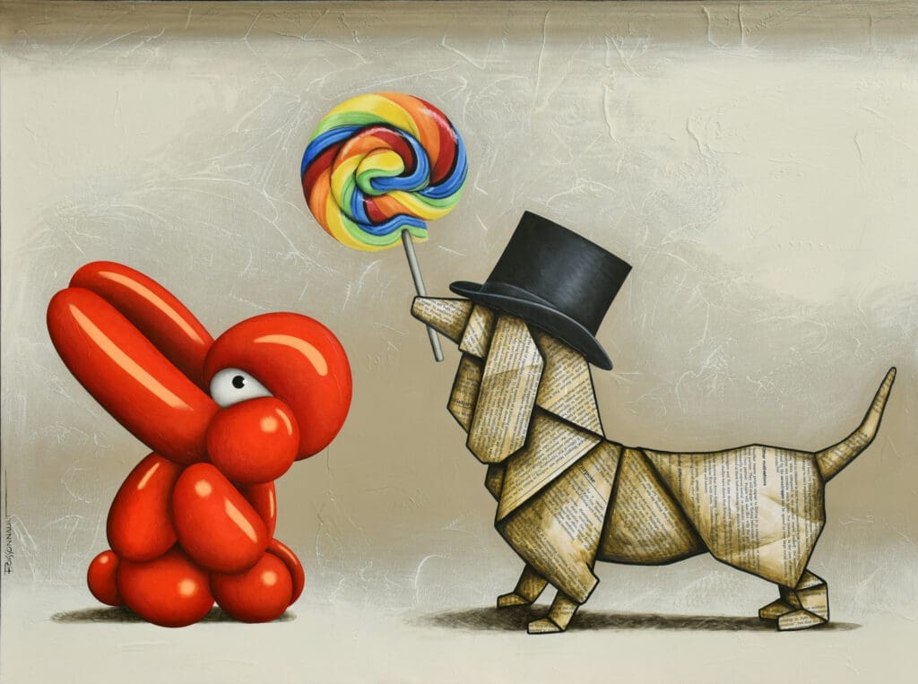
Boissonnault’s work finds a delightful balance between playfulness and elegance. The origami animals are layered with text, maps, and colorful graffiti that will bring in you in for a closer look. Representing universal themes like love, friendship, and our connection to the environment, her work adds a hopeful and whimsical presence to these collectors’ homes.
Depending on the color palette, Liz Barber’s abstract paintings may evoke ocean scenes, spring flowers blooming, or a serene cloud formations. The flowing, organic layers of mixed media are peaceful and engaging in any setting.
Rose Masterpol’s work covers an impressive range of abstract styles, from mid-century inspired geometric pieces to expressionist action paintings. This versatility allows her work to be enjoyed by many different types of contemporary collectors. Often created in large format, Masterpol’s paintings create a bold statement in the interiors they occupy.
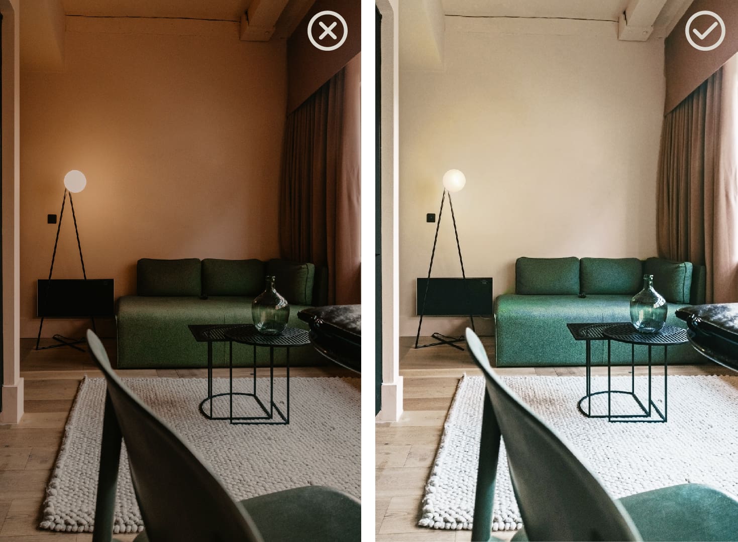
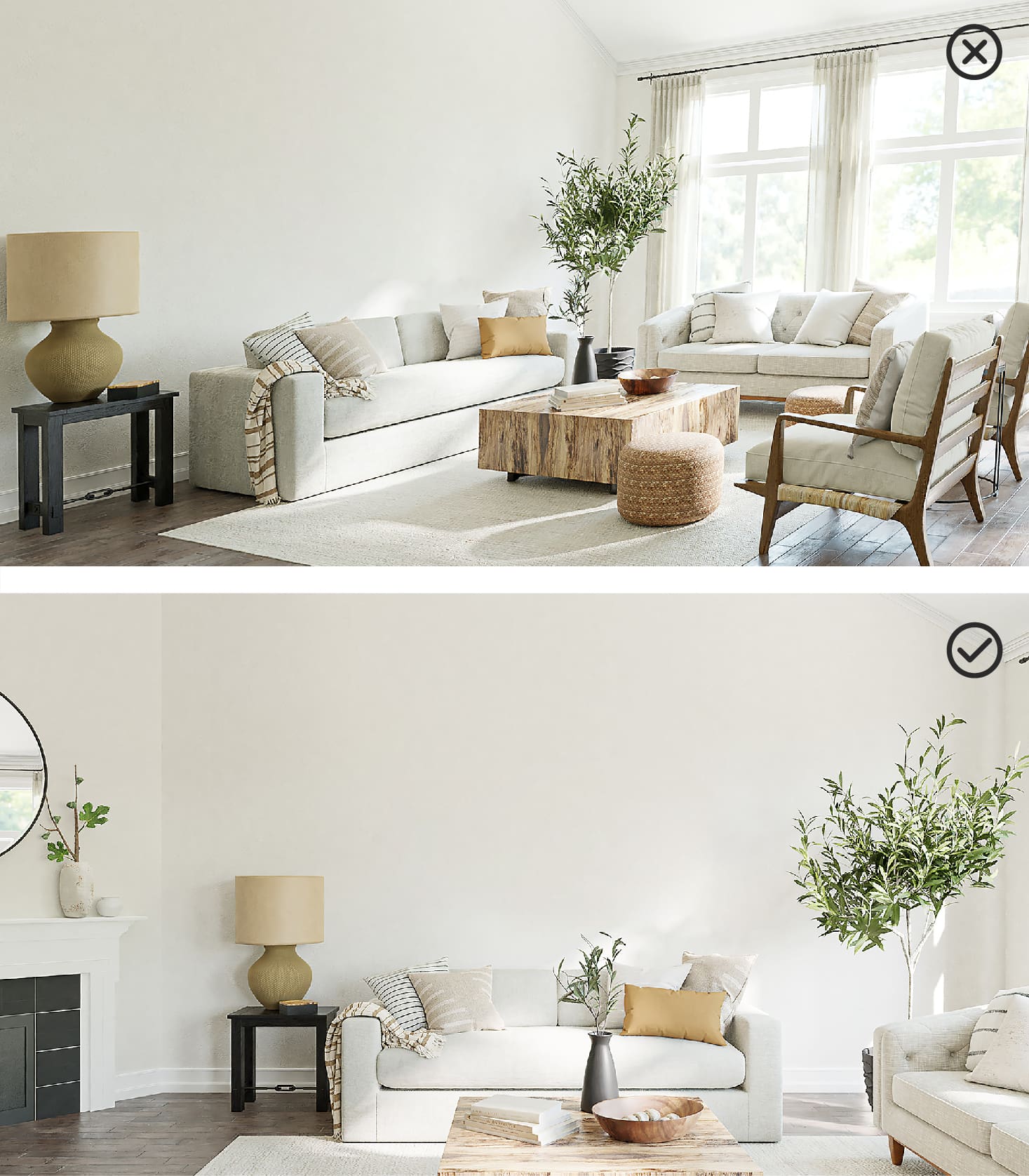
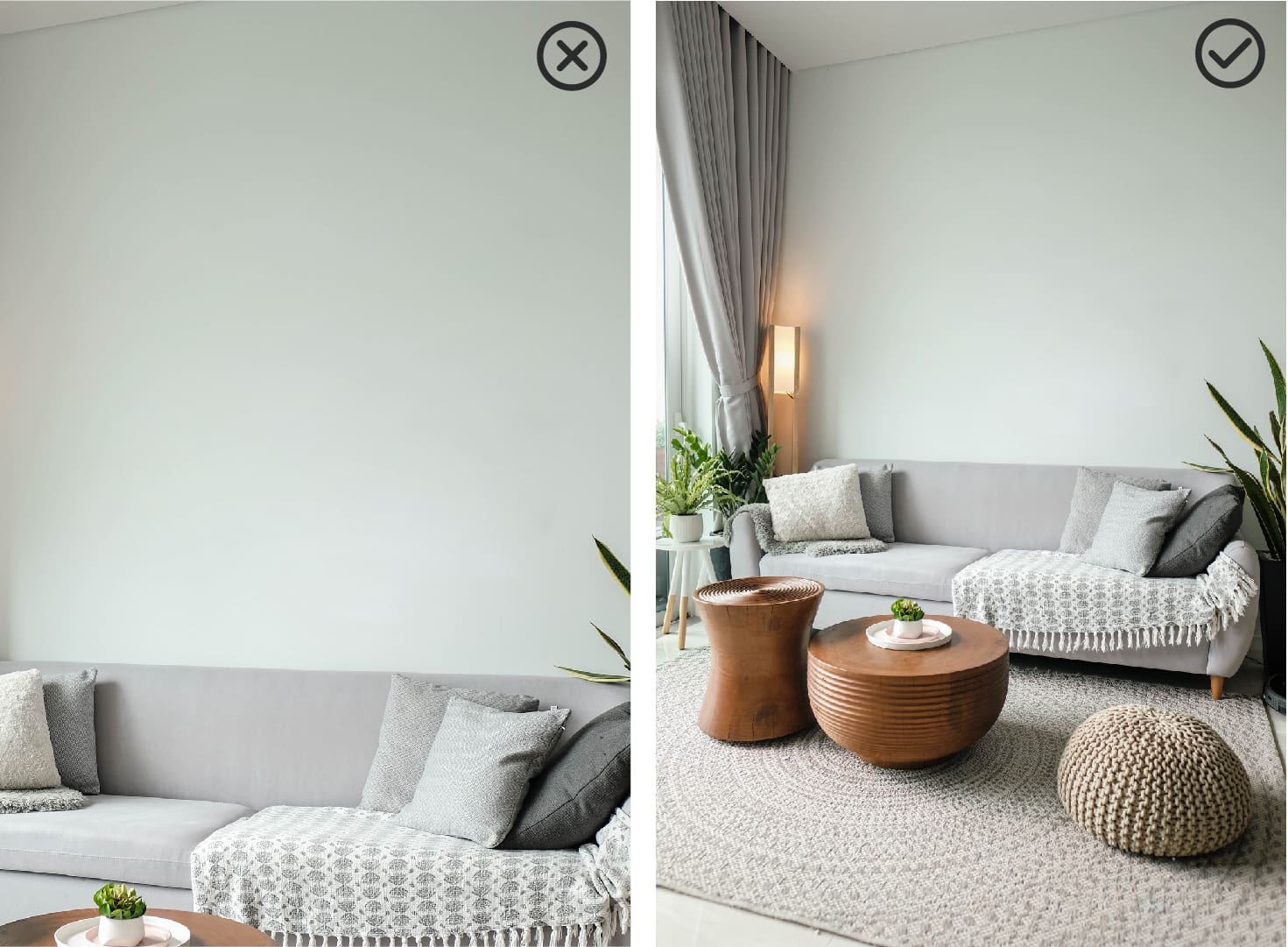
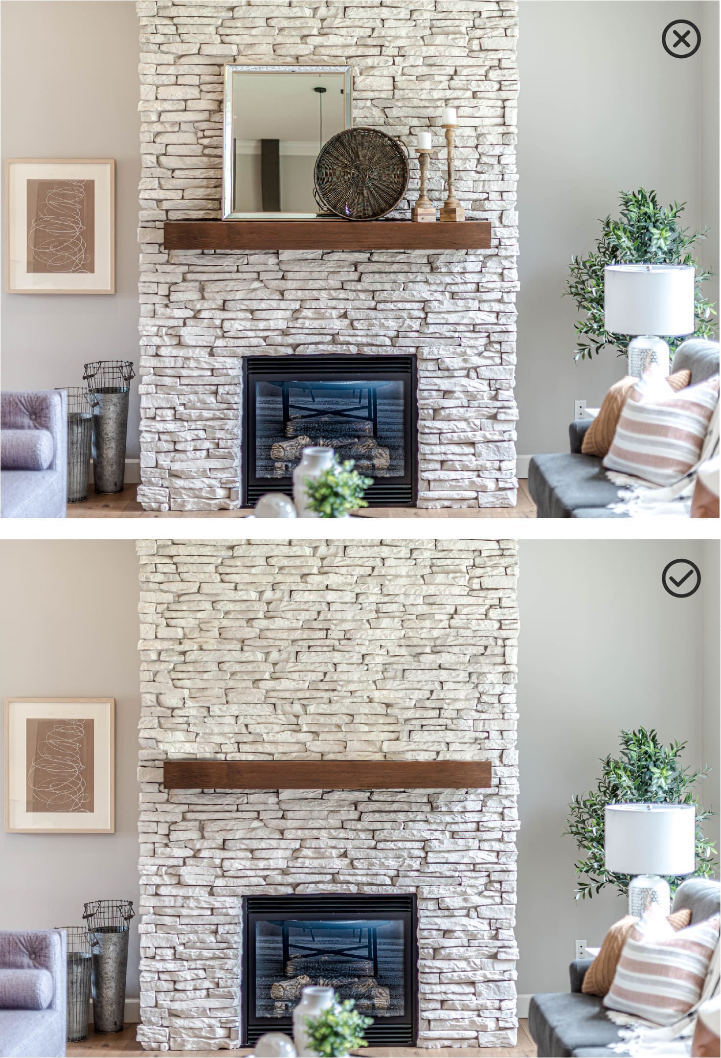
You just added a new work of art to your personal collection—next step, decide where to place it! Taking the color palette and composition into consideration, choose a backdrop that will accentuate your favorite elements of the artwork. Check out some examples below that demonstrate how wall color, brightness, and pattern can bring out different aspects of your piece.
Maximal vs. Minimal
Randal Ford photographs his wildlife subjects in the studio, removing any distractions and allowing you to focus on each animal’s personality and gestures. With its crisp white background, Upside Down Sloth can add a bit of relief to an intricate wall covering or harmonize perfectly in minimalist surroundings.
Randal Ford, Upside Down Sloth, Photograph on Paper, 32 x 32 inches
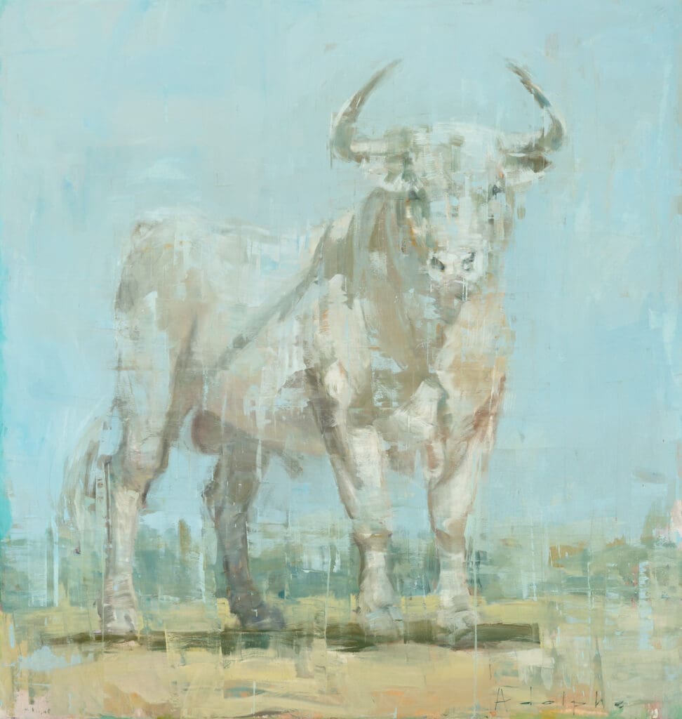
Shades of Blue
On this sky blue wall, Joseph Adolphe’s A Whisper feels especially serene, complementing the airy atmosphere of the space. On the other hand, placing the piece on a navy backdrop creates a striking contrast and brings out the drama of the composition.
Joseph Adolphe, A Whisper, Oil on Canvas, 36 x 43 inches
Understanding Undertones
Marilyn Borglum’s Nouveau Bay may appear neutral at first glance, but there’s actually a complex array of tones layered into this painting. Placing the piece on a pink wall really brings out its magenta undertones, making it feel softer and feminine. On the mossy color, darker and cooler tones start to come forward.
Marilyn Borglum, Nouveau Bay, Acrylic on Canvas, 42 x 42 inches
Black and White
It’s amazing to see how the mood of Hutch Scotch by Hunt Slonem changes in this example. The dark room accentuates the brilliance and sophistication of the gold paint and thick black frame. In the white room, Slonem’s bunnies are still very refined, but take on a lighter, more whimsical tone.
Hunt Slonem, Hutch Scotch, Oil on Canvas, 44 x 50 inches
Pezhman, Boudoir Reflection II, Mixed Media on Canvas, 60 x 48 inches
My clients were immediately drawn to Boudoir Reflection II by Pezhman for their Florida condo. We were able to find the stunning large scale Goldhammer to complement the piece in the open concept space.
This was an exciting project because most of the work was done through virtual presentation, utilizing both FaceTime and Photoshop. We are all over the moon with the final result… and that’s a WOW!
—Marcie (Senior Art Consultant, Haverford)
Amber Goldhammer, Happy Sounds of Youth, Mixed Media on Canvas, 70 x 70 inches
Learn more about Virtual Presentations and how they can be a helpful tool for clients who are located out of town, renovating their homes, interested in oversized work, or just have busy schedules!
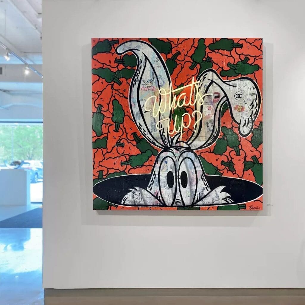
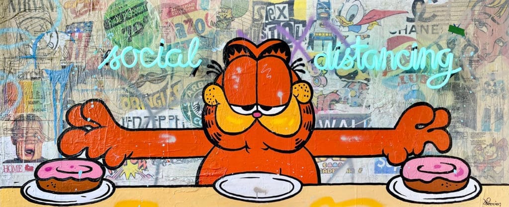
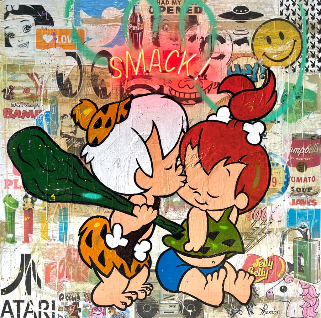
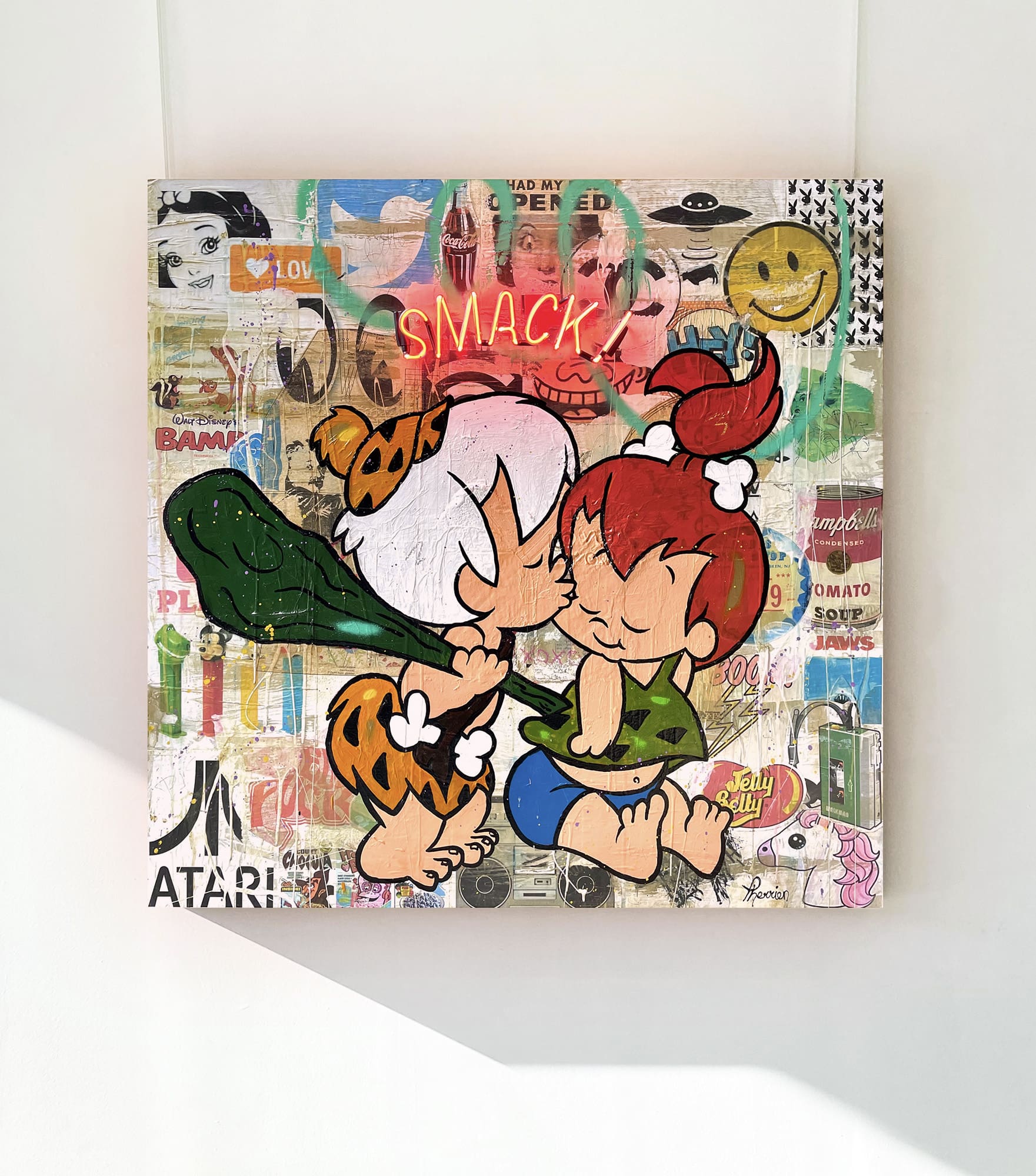
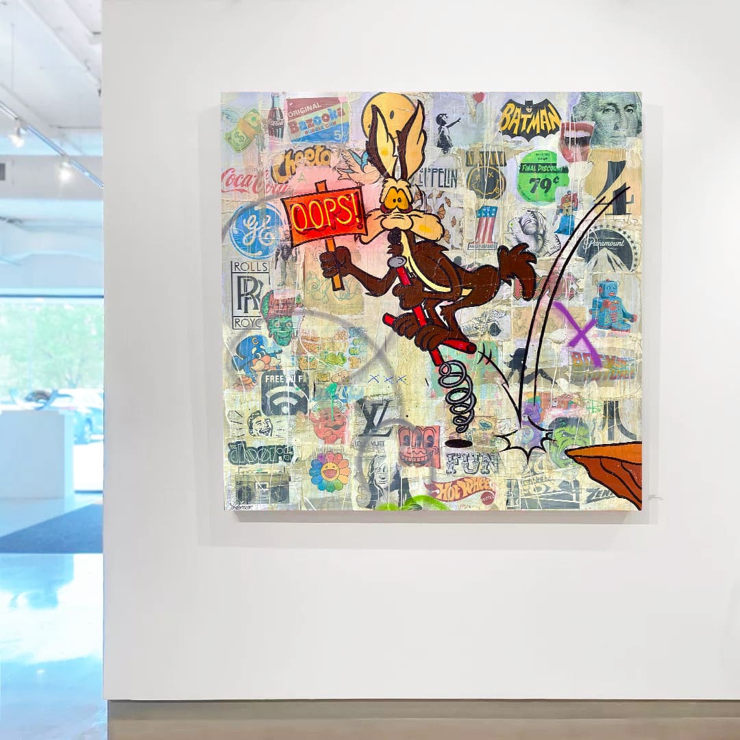
Rock Therrien’s work integrates collage, stenciling, and text, illuminated with colorful neon. With beloved cartoon characters as his subjects, each piece has a touch of nostalgic humor.
We’ve placed figures like Snoopy, Bugs Bunny, and Garfield in collectors’ homes, and now we’ve added three more timeless characters to our collection: Pebbles and Bamm-Bamm and Wile E. Coyote!
Smack II
Rock Therrien, Smack II, Mixed Media With Neon on Board, 48 x 48 inches
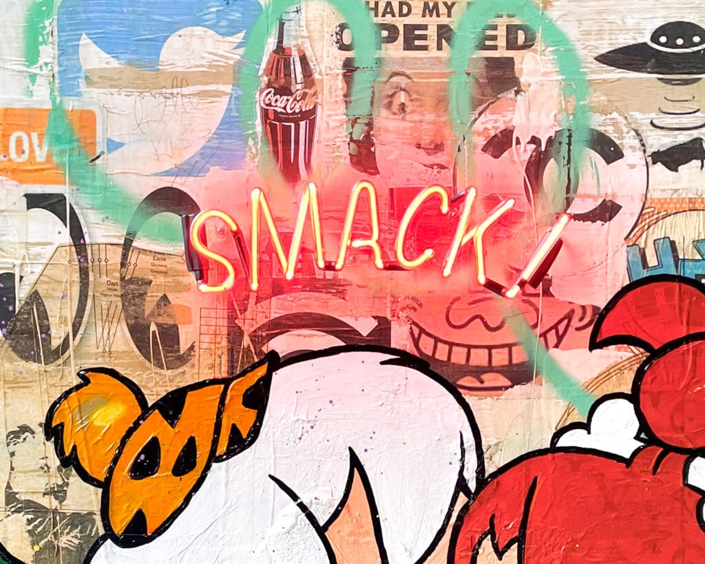
Smack II (detail)
While the neon might catch your eye first, there’s so much more to explore in the background of each piece. Take a closer look to find dozens of pop culture references along with a variety of textures, mark-making, and paint drips.
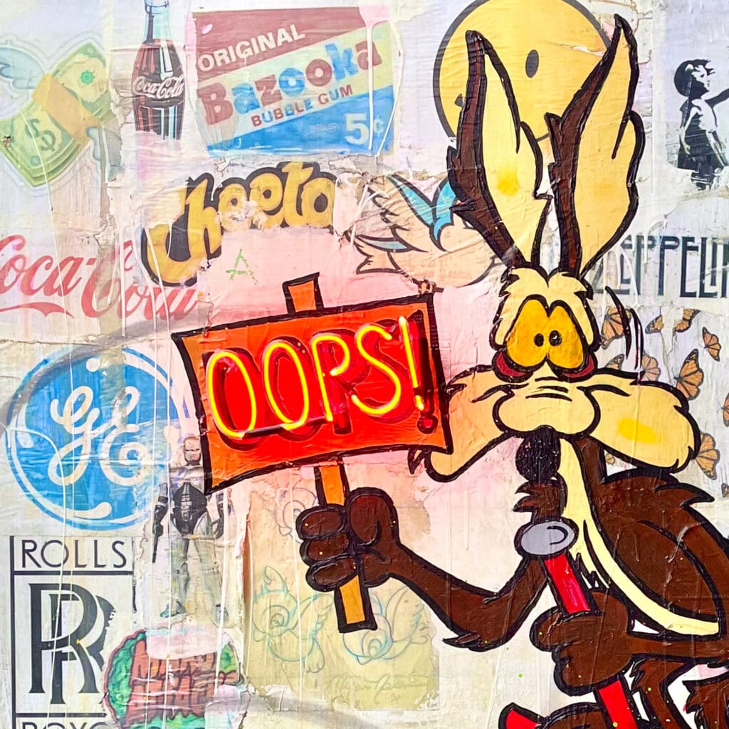
Oops!
Rock Therrien, Oops!, Mixed Media With Neon on Board, 60 x 60 inches
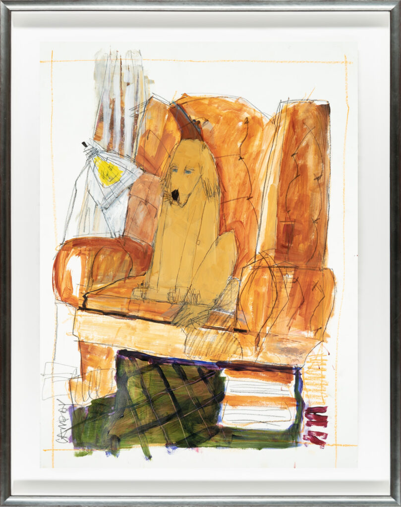
Dennis Campay, The Warmth of Light, Mixed Media on Paper, 30 x 22 inches
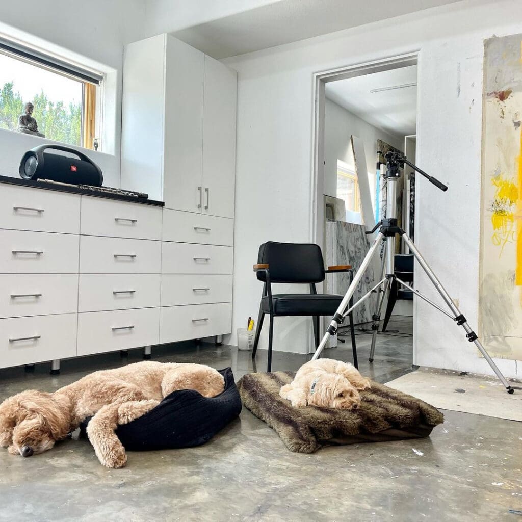
From Pablo Picasso and his beloved dachshund Lump to Salvador Dali and his ocelot Babou, artists throughout history have been counting on their pets for companionship, company in the studio, and even inspiration for their work. It turns out the artists we represent are just as defenseless against a cute pair of puppy dog eyes—meet some of their pets below.
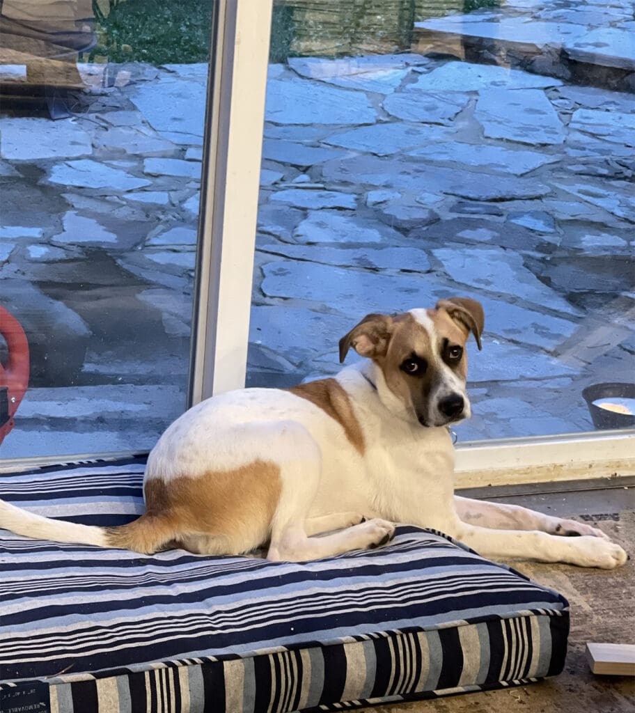
“I have two pets: Rusty, a Golden doodle (age 5) and Haley, a Cockapoo (age 11). Rusty is a comical guy, very athletic and very loving. We hang in bed in the mornings, and he is literally on top of me kissing me and cuddling me.
Haley is a Buddha; she likes to meditate and read books (Well, if she could). She is super smart and only 20 pounds, so cuddling with her is sweet. They love going hiking and being with my partner and I no matter what. But when we have to leave the house, they have such sad faces… it is hard to leave them.”
“I’ve really wanted a dog I can bring to my studio. He’s an 11 week old Nova Scotia Duck Toller named Danni. He’s the cutest and loves being in the studio.”
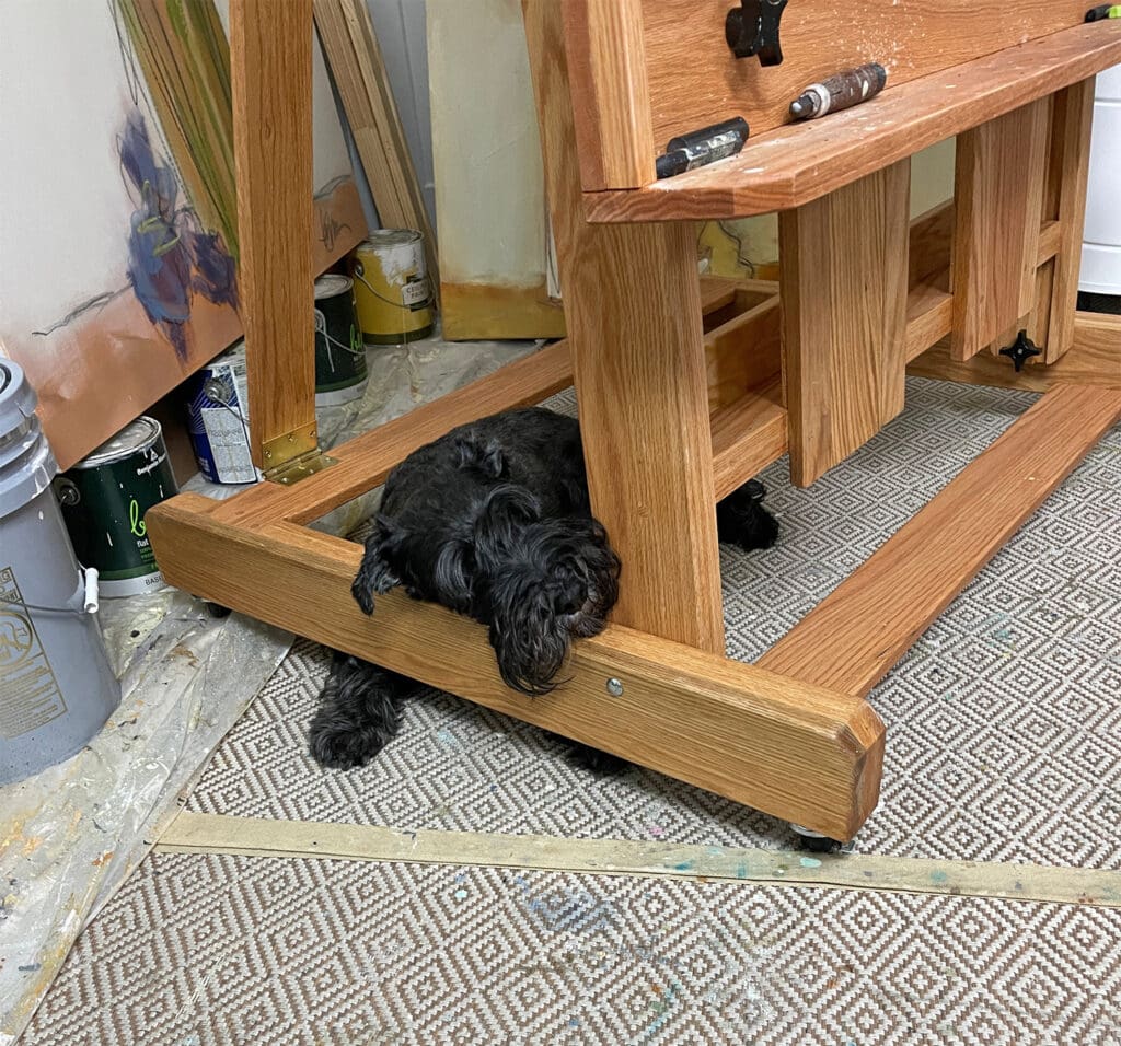
“Tippy the Standard Schnauzer. She is my shadow, always by my side making me smile. We say her personality is that of a Sour Patch Kid, sometimes sweet and sometimes sour. She just turned ten in July and still acts like a puppy.”
“My favorite pet is Cooper, our 11 month old rescue. Our daughter moved out and took her lab with her. Her dog used to hang out in my studio at night. My studio is separated from the house so she could run around in the yard then come in to rest in my studio. Cooper has taken her spot and besides running out with my brushes or painting rags, he is a great studio mate.”
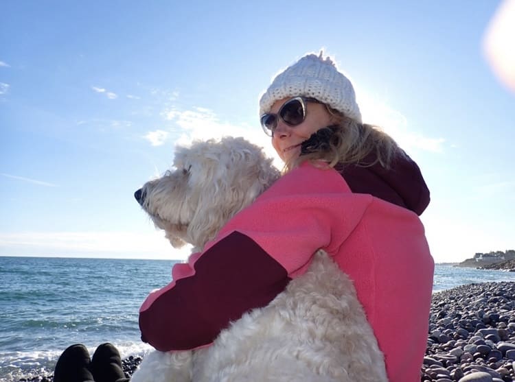
I have a Goldendoodle named Sydney. Sydney is my shadow all day long. She brings joy wherever she goes. While I paint in the studio she gazes attentively out the windows at any chipmunk, squirrel or bird in the yard. We live in a dense suburban forrest with a creek just behind us. It is wild kingdom out there. Great doggie tv.
“I am down to one aging Dachshund from initially two. Millie is still around at 17 years. Her brother Mikey died a couple of years ago. They were rescue dogs so they came with baggage. Mikey was a character not beloved by all as he didn’t trust new people, but he adored me.
Millie has always been shy, and at this age her favorite hobby is napping.”
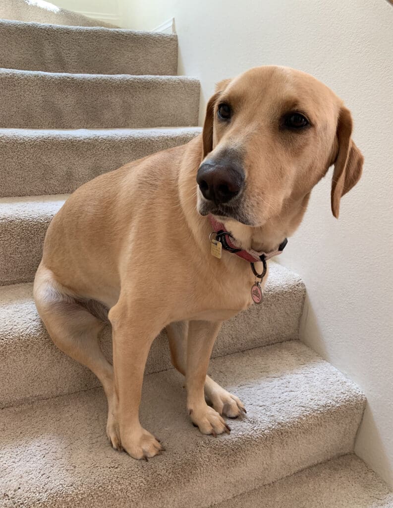
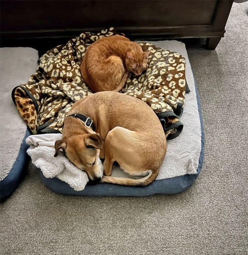
“Currently, we have two cats (Sunny and Luna) and one dog (Chase) in our home. Our two cats are brother and sister but couldn’t be more different in appearance and personality!
Chase is a true sweet heart and loves traveling with us when we go camping. We adopted him from our local animal shelter and has brought so much love and fun to our family.”
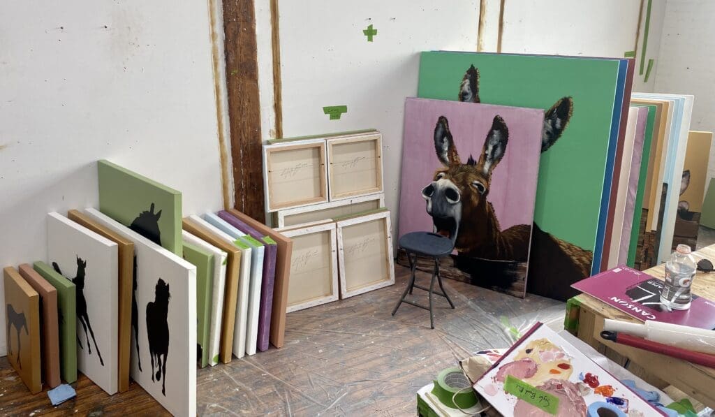
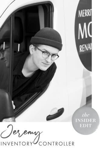
Nothing makes me happier than to work along with our amazing team here at Merritt Gallery and Renaissance Fine Arts. As an inventory controller and art handler, I have the great opportunity to closely examine the artist’s work when it first arrives. I also then get to zoom out and see all the art pieces on walls and pedestals where they hold their space in the gallery and homes of clients. Seeing the artwork’s journey from start to finish is a truly joyous and unforgettable experience.
Here are just a few of the artists that have caught my eye.
Liz Barber, Garden 16, Mixed Media on Canvas, 59.5 x 60 inches
Liz Barber | Garden 16
Barber’s work sets up a lot of room for me to be creative. I always find myself planted in front of a piece of hers searching and exploring for something familiar.
Donald Sultan, Wallflowers XXIII, Screenprint, 24 x 22 inches
Donald Sultan | Wallflowers XXIII
Sultan’s Wallflowers series is so satisfying to me. How just a few colors, marks and raw paper can convey a moment in time so poetically. I love his handwriting along the side of the paper as well, his works are whimsical yet elegant.
Ben Schwab, Inversion, Oil on Canvas, 48 x 60 inches
Ben Schwab | Inversion
I love getting lost in Schwab’s paintings. I’m never quite sure what is surface or space until I start digging into the image; picking and associating colors with reflective surfaces or the sky scape. The various suggestions he makes with perspective and color are mind bending!
jd Hansen, Valley of the Sunrise, Bronze and Copper, 37 x 46 x 24 in.
In this new arrival by sculptor jd Hansen, an elegant bronze horse is shown walking out from underneath an intricate copper blanket. To Hansen, the blanket symbolizes being wrapped in thoughts which can be both oppressive and comforting. “Sunrise” refers to a new day, a new beginning, free of those thoughts.
The words are written by the artist herself in German, a language whose precision she finds fascinating. Using a language other than English allows the viewer to see the words as a textured handwritten blanket, rather than focus on individual familiar words.
English Translation
The sun rises slowly,
warming this blanket of comfort,
this blanket of burden.
I am comforted by the familiar echos;
I am haunted by their cadence and stance.
Thoughts upon thoughts,
the architecture of the soul,
their tentacles like tree branches,
reaching every crevasse.
I hold tight to one and walk toward the sun,
everything unraveling behind.
Leave these memories to the soil and the earth,
to decompose and reemerge as light and love.
Original German
Die Sonne geht langsam auf,
wärmt diese tröstende Decke,
diese Decke, die auf mir lastet,
beruhigend der vertraute Wiederhall,
heimsuchend der rhythmische Widerstand.
Gedanken über Gedanken
Architektur der Seele
Ihre Fühuler wie Zweige
Reichen in jede Kluft
Ich halte mich fest
und gehe auf die Sonne zu,
hinter mir löst sich alles auf.
Lass die Erinnerungen in den Boden,
In die Erde, um zu verwesen
Und aufzuerstehen als Licht und Liebe.
Earlier this month, we celebrated the opening of Love Story, our solo show with L.A. based graffiti artist Amber Goldhammer. Our team had a fabulous time meeting Amber, chatting with collectors and art lovers, and enjoying the vibrant, uplifting works in our Chevy Chase gallery.
The evening was captured by photographer Doug Sanford—check out some highlights below.
Amber in Action
The day before the reception, we had another special event in the gallery…Amber got out her spray paints and awesome pink mask, and created a painting and mural right on the gallery wall. It was such a treat to see Amber in her element. The painting, Spontaneous Fun, is now available for purchase—contact usfor more details.
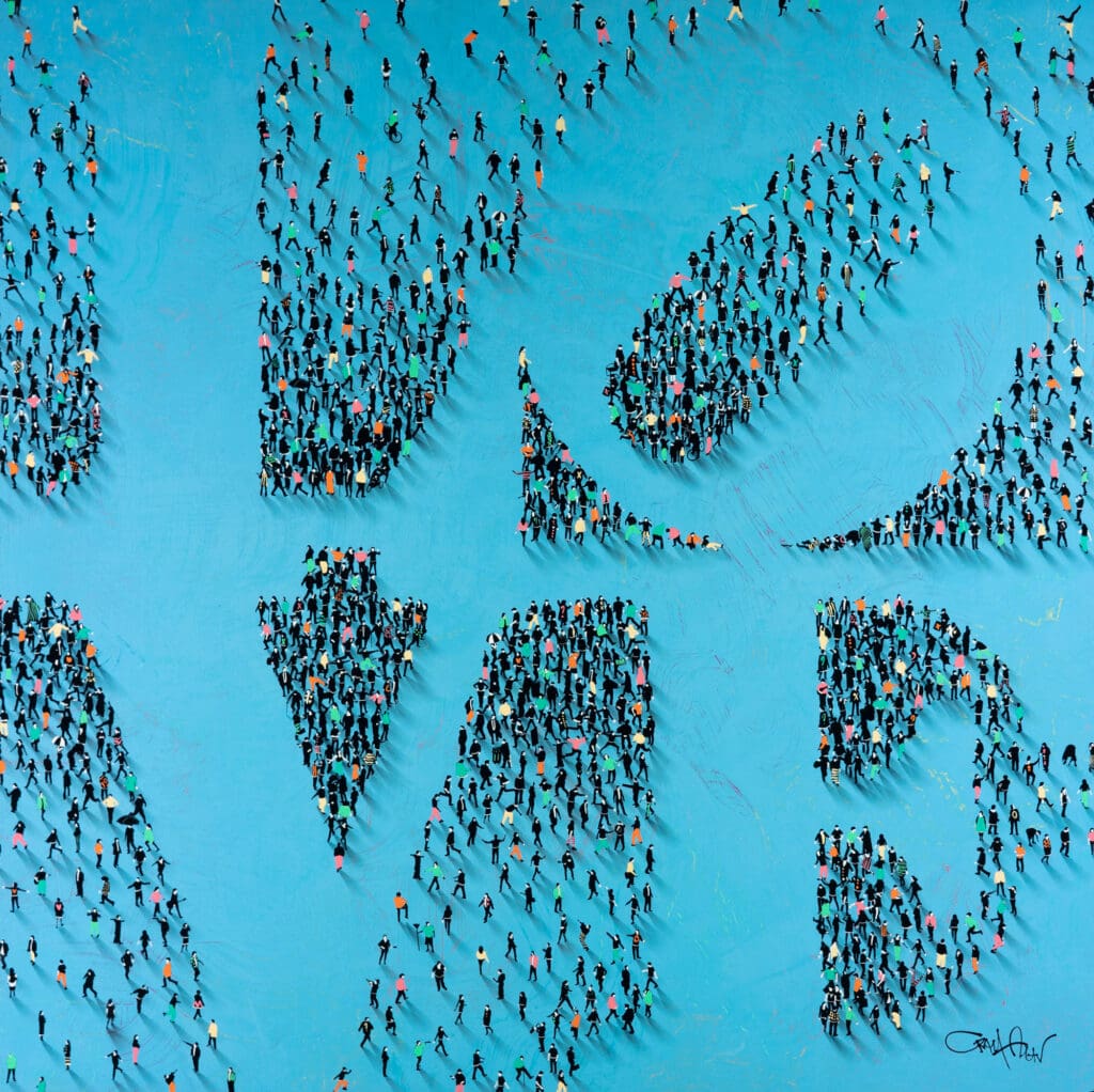
These recent arrivals focus on something that many of us have gained a new appreciation for over the past couple years—social life. Explore three totally different looks at gathering, social interaction, and public spaces.
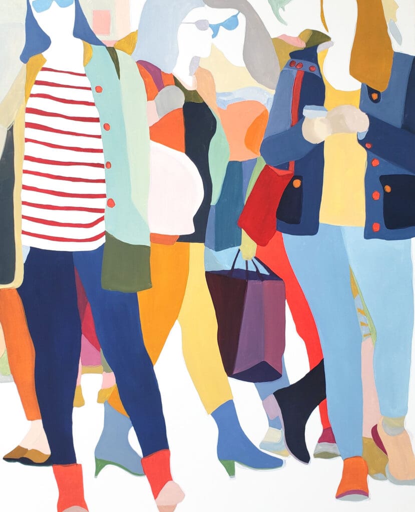
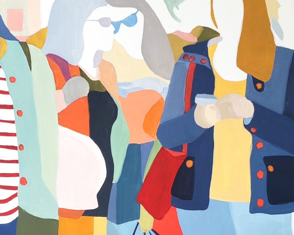
Czekus | Public Place
Sherry Czekus, Public Place, oil on canvas, 60 x 48 inches
Sherry Czekus’s work conveys the feeling of being part of a crowd—walking, socializing, and moving together through a busy city. The color blocked figures have enough anonymity that you can picture yourself immersed in the scene and feel the energy of the crowd.
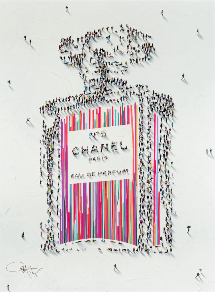
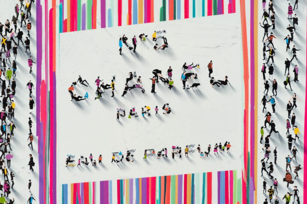
Craig Alan, Populus: Chrome No. 5, mixed media on metal, 48 x 36 inches
Zoom in on Craig Alan’s Chanel No. 5 bottle to find yourself in an imaginary city filled with vibrant social interactions. We guarantee you’ll see a new detail each time you look.
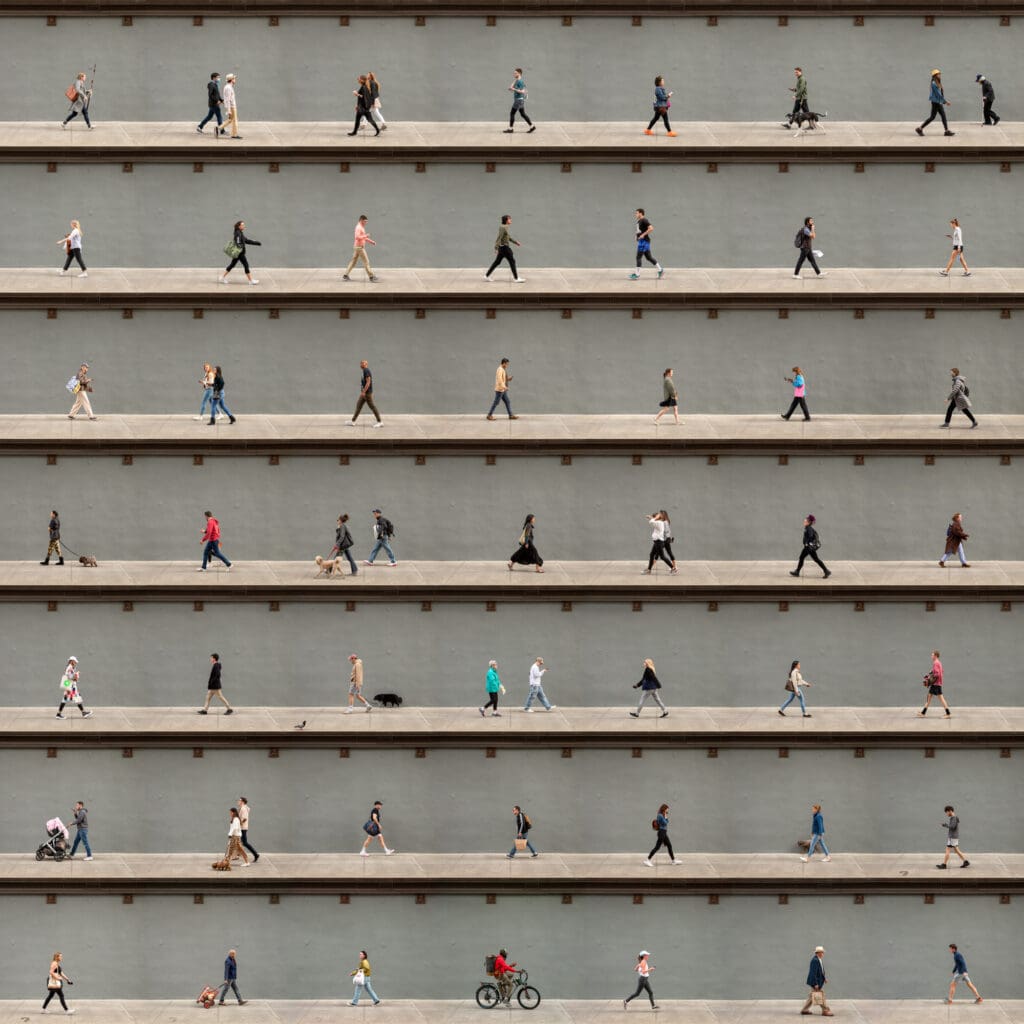
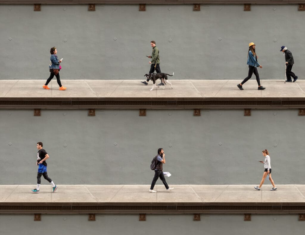
Xan Padron, Horatio Street, NYC, photograph on aluminum, 45 x 45 inches
The figures in this Padron photomontage were captured at different moments throughout the day. However, you get a sense of togetherness and community through the shared experience of walking past this specific spot. The individual people form a portrait of the neighborhood itself.
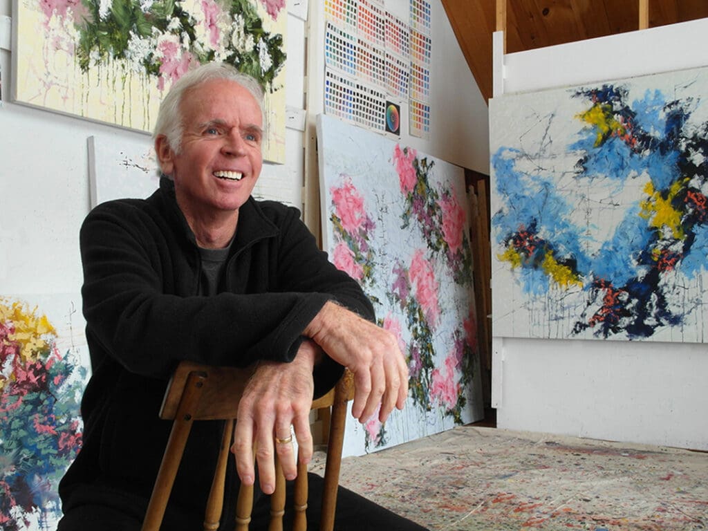
Not just a painter, but also an Emmy award winning documentary filmmaker, David Skillicorn has dazzled clients with his textured and colorful abstract work for years. Within his ever-evolving style remains a common theme: nature. Skillicorn paintings are not simply based off the nature that he sees, but rather the experiences of the natural world that are a part of him.
“There is no question, Nature, with a capital N, is by far the best art of all. Infinite in variety, detail and interest, never ending, always changing.”
Tell us about your background. When did you start creating art?
I had a long and extraordinary career making documentaries for television, traveling all over the world and having more amazing adventures than I can even remember at this point. But like many things, after twenty-five years I sort of felt like I’d “been there, done that”, and just wasn’t feeling the “juice” anymore.
Then one day I was filming a documentary about artists on Cape Cod and met up with a master painter out on the dunes of Wellfleet at dawn. Having literally no inkling, knowledge or interest really in painting myself up until that moment, I literally had an epiphany looking over this artist’s shoulder as he created “magic” on canvas right before my eyes. It was amazing! I knew in that instant that I had to become a painter, even though I had no clue where to even begin! And so I did, one step in front of the other, day after day, year after year, and I’ve never looked back.
Now after more than twenty years painting, I can also say, there is no end in sight, and the challenge and interest for me is as fresh as the first canvas I ever attempted.
Describe your creative process.
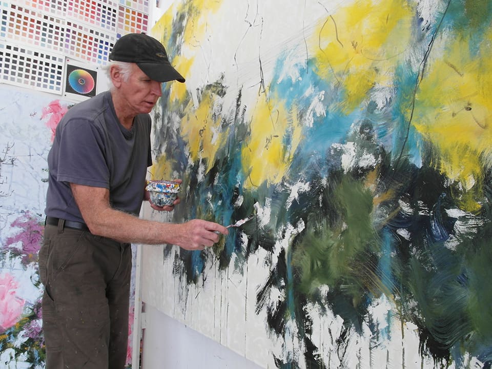
I would say that I “channel” intuition and “discover” painting along the way more than I “make” it.
Having said that, there are certainly parameters and techniques I’ve established through trial and error and often years of exploration in any given series I do, but all of those “techniques” are just baked into the DNA now. I don’t think about them literally while I’m working, they are just there to use, like breathing in a way. The literal mechanics of taking a breath just happens automatically, we don’t think about it as we go along. So when I’m painting, far far and away intuition and feeling are the driving forces in the creation of the work. I want to be surprised and delighted with the result.
What is your studio space like, and how does it affect your process?
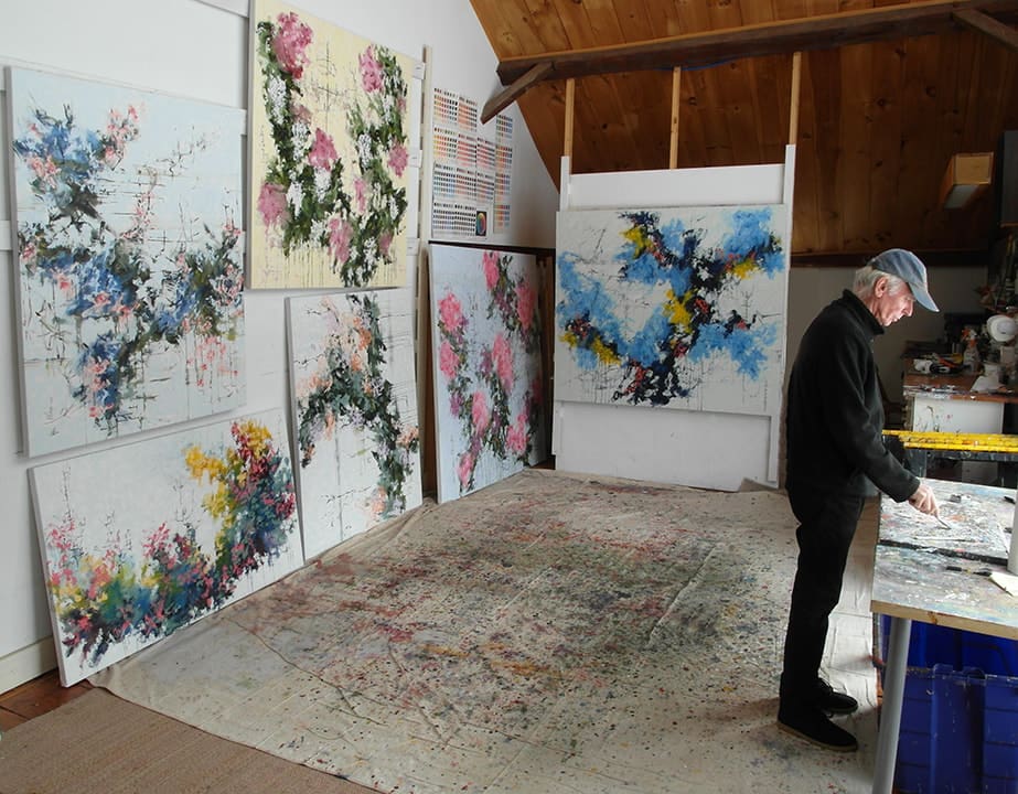
I am fortunate enough to live in a large 1840’s Victorian house in a small New England village, which often seems more aligned with the pace and sensibility of the 19th century than anything else.
My studio is on the second floor of an old three story barn attached to the house. It’s all old wood, has a soaring ceiling and a wall of windows facing out to our gardens, meadows and the pond beyond. Needless to say, it is a soulful and peaceful space to clear the mind and open up to creating new work.
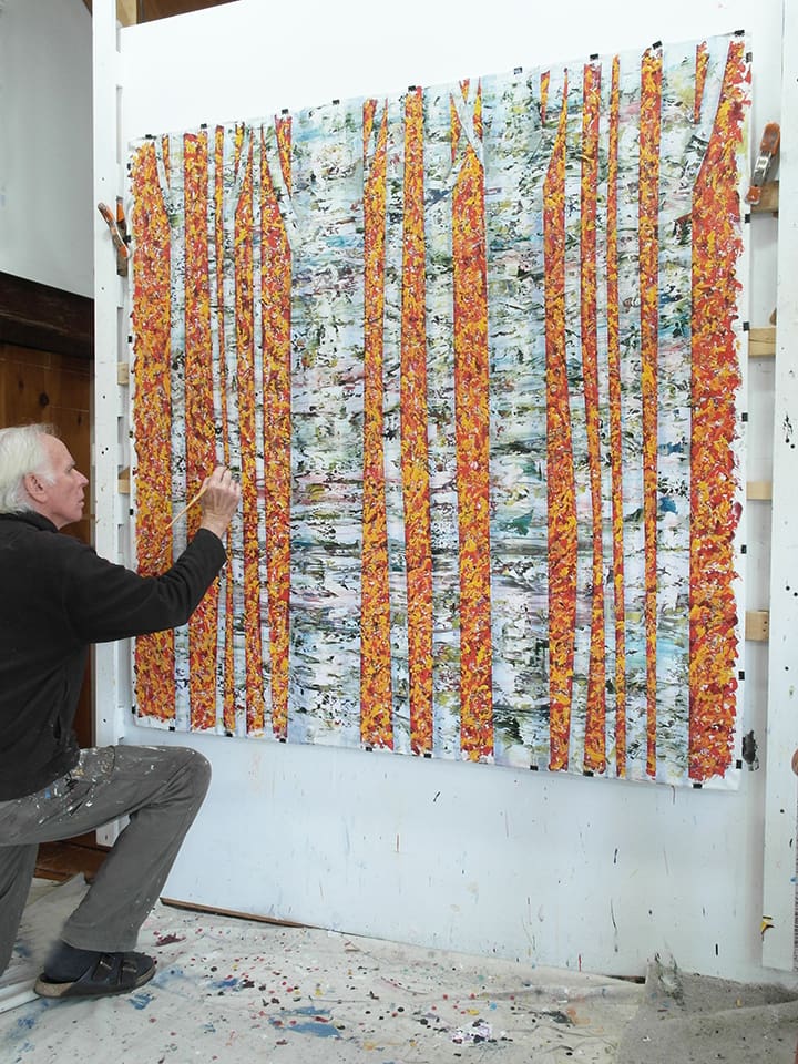
Can you tell us a bit about the inspiration behind the Botanica and Nel Bosco series?
There is no question, Nature, with a capital N, is by far the best art of all. Infinite in variety, detail and interest, never ending, always changing. What all artists attempt to do, pales in comparison. While my work is abstract and intuition driven, how could I not be deeply influenced by the natural world? The view from my studio itself is full of nuance and ever evolving interest, all of the time.
The Nel Bosco and Botánica paintings are clearly nature based works referencing trees and flowers, etc. While I do not literally look at a tree or flower, and try to render them abstractly, ALL of those images and my experiences of the natural world are within me. They come out as they do, entirely intuitively.
What do you hope viewers see in your work?
For me, the paintings I make are not “about” something, or art “objects” per se, as much as they are an opportunity to set in motion the imagination of the viewer and perhaps trigger an emotional response. I hope that the paintings have a sense of presence about them which can bring a bit of feeling or soul into the space they end up in. Something intangible that is felt viscerally, even in a small way, each and every time one looks at it.
That is the hope, and it’s a prospect worth shooting for each and every time I start a painting.
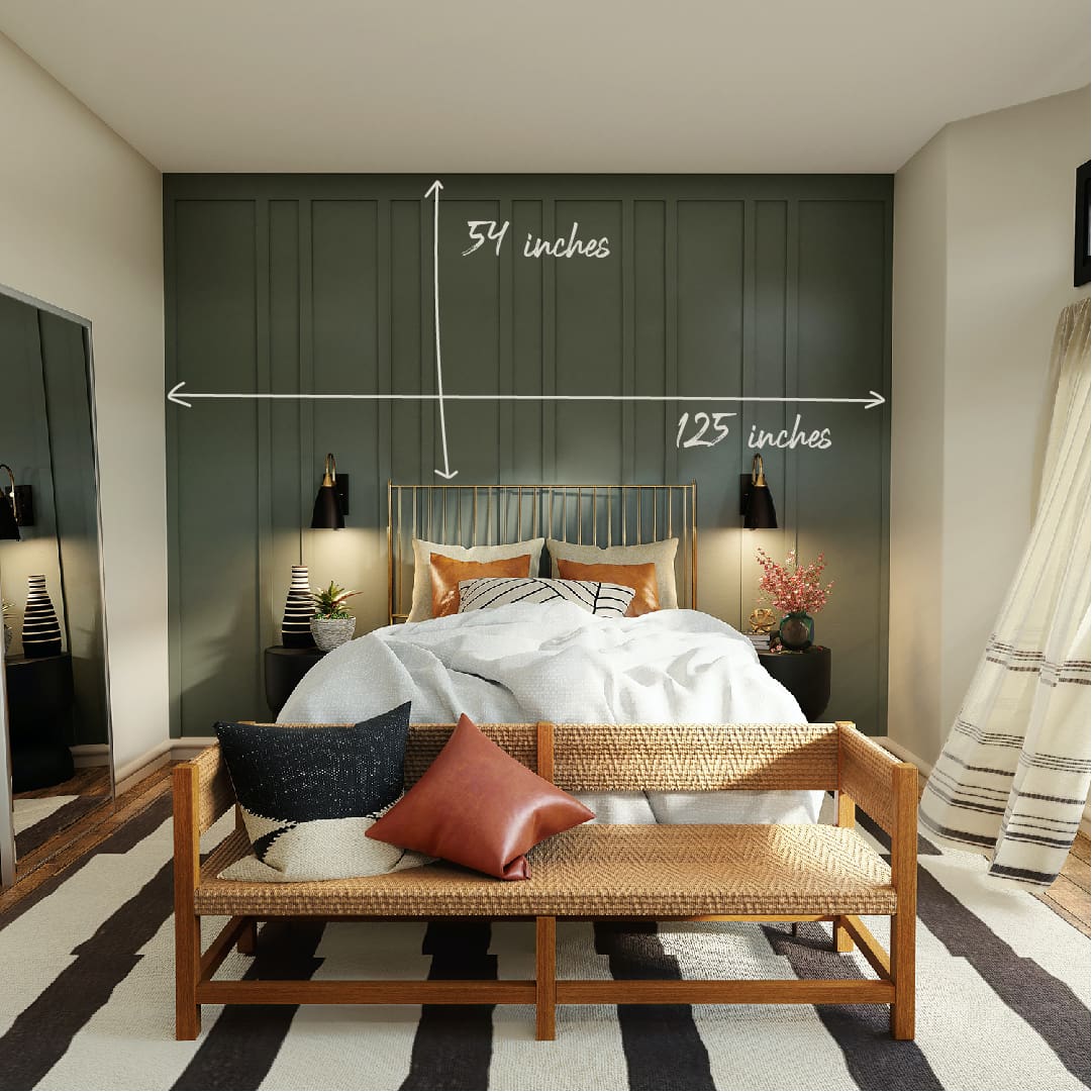
For collectors who aren’t local, who need artwork for their vacation homes, or who are simply crunched for time, virtual presentations can be a super helpful tool. Just send us a photo of your room, and our team will Photoshop in the pieces you’re considering.
To get the most out of your virtual preview, follow these tips for photographing your space:
#1 Let There Be (Natural) Light
To get the best lighting, try to take your photos in the daytime with any natural sunlight you can get. Turning off pendants or standing lamps will avoid unwanted warm tones, helping us depict the artwork colors more closely.
#2 Play It Straight
Whenever possible, we suggest snapping a pic that faces your art wall straight-on. A slight slant is no problem, but the bigger the angle, the more distortion (and the less artwork that you can actually see!).
#3 For Good Measure
To give you the most accurate artwork preview, we’ll need some measurements! This could be the width and height of the wall, or even the dimensions of a key piece of furniture like the headboard in the photo above.
#4 Give Us Some Space
Don’t feel like you have to photograph your wall as close as possible. We actually love getting a bit more context—it will give you a better idea of how different artworks harmonize with your entire space.
#5 A Clean Slate
Removing any objects blocking your wall and photographing a clean, blank space is always the best way to get started. Plus our Photoshoppers will be eternally grateful!
Ready to see the possibilities for your space?
Reach out to your favorite art consultant or email the gallery the get started.
I have a background in art direction and spent many years working in advertising. What I found is that I missed what I started out loving, which was making art and being with others that appreciated art. Working as a Gallery Assistant has been such a wonderful experience. Seeing how excited clients are when they fall in love with a piece is amazing.
—Emily, Gallery Assistant, Haverford
JOSEPH ADOLPHE
Joseph Adolphe, Toro Blanco No. 2, oil on canvas, 80 x 76 inches
When I first saw Joseph Adolphe’s work in the gallery it was clear that in addition to being an exquisite painter he was also a deep thinker. His depiction of animals, like the bull in Toro Blanco No 2., have a depth to them that goes beyond a figurative depiction.
I’m also very fond of his Locution series. The pieces are so large that it feels as if you’re peering through a window at a surreal landscape.
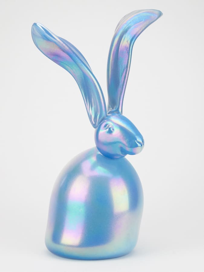
Hunt Slonem, Ada, Handblown Glass, 16 x 10.5 x 8 inches
I knew of and loved Hunt Slonem’s work even before I started at the gallery, although seeing it in person is such a different experience. I find his work exciting and it really just makes me happy. I love his glass bunnies, I wish I could fill an entire room with them.
I’ve also enjoyed reading more about his background and inspiration. He has an interesting personality and unique point of view, which is evident when enjoying his artwork.
Donald Sultan, Wallflowers XXVI, Screenprint, 24 x 22.5 inches
Donald Sultan’s flower screen prints are my favorite pieces in the gallery. I love how delicate they feel and his use of negative and positive space is so purposeful, it feels perfect to me.
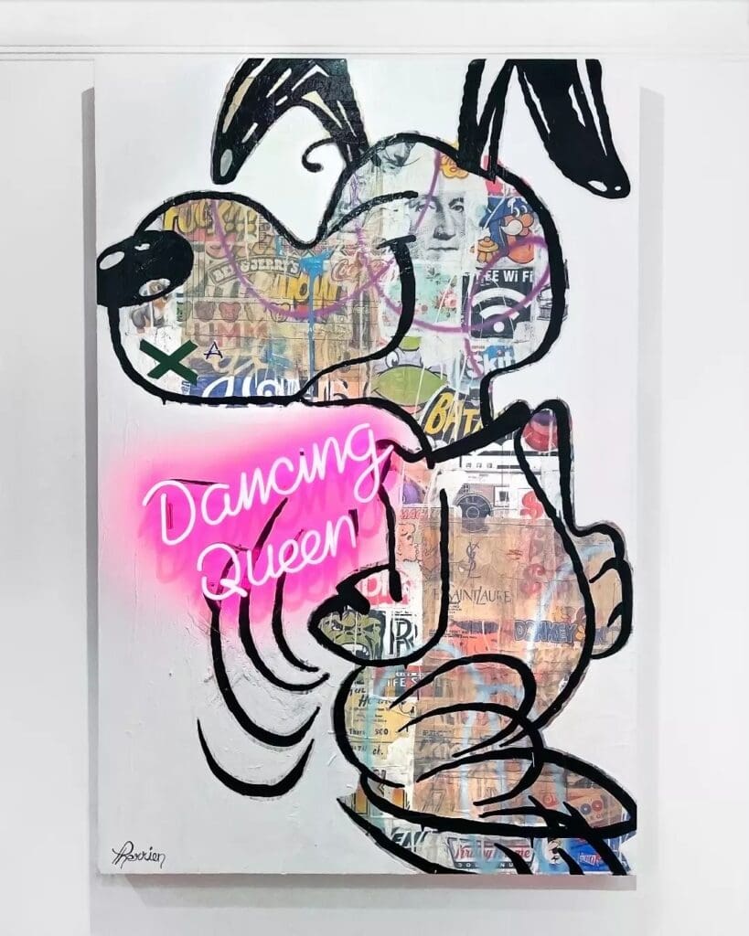
Rock Therrien’s work integrates neon with collage, stenciling, and writing, always with vibrant color and a touch of humor. Focusing on beloved cartoon characters like Snoopy and Garfield, Therrien encourages the viewer to think back on their own childhood memories and explore each piece with a feeling of nostalgia.
Describe your creative process.
To start, I think of a title for the neon. Then I do a search among all the cartoon icons that marked my youth to correspond with it.
When did you start creating art?
I am self-taught. I have always been attracted to drawing, and I won drawing competitions when I was very young . The arts have always been part of my life—I have been exhibiting my work in art galleries for over twenty years.
Dancing Queen, Mixed Media with Neon on Board, 72 x 48 inches
What do you hope viewers see in your work?
The first thing I want them to see in my works is the graphic aspect. I draw their attention with the subject as well as with a neon. It works quite well!
I want to plunge the spectator back into their childhood memories and help them rediscover their youth for a moment.
How would you describe your studio?
My workshop is at home. It allows me to work on my pieces at any time. It’s a very big room, so I can have space while I work and listen to music.
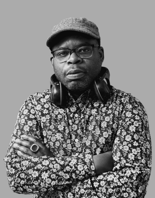
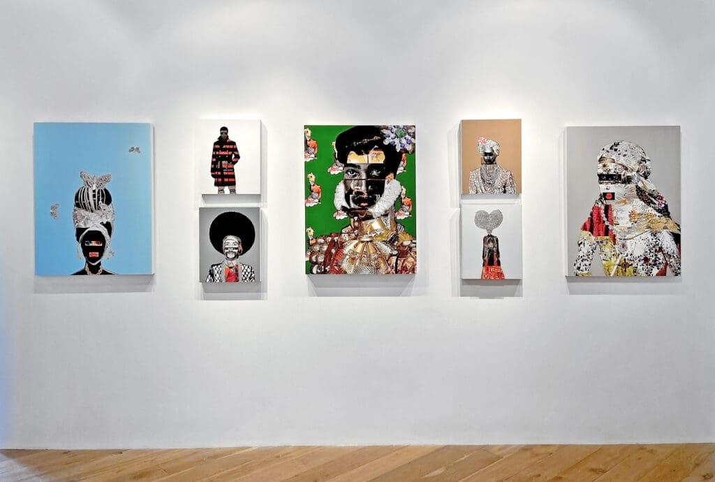
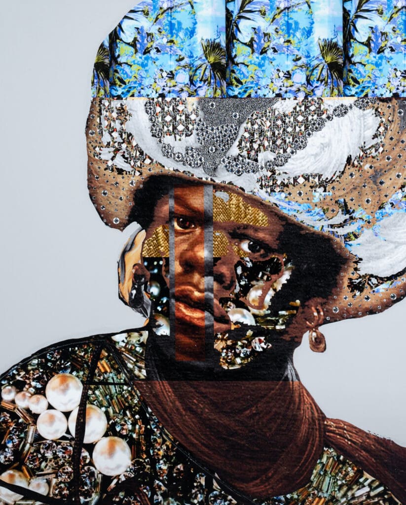
Gavin Benjamin’s evocative portraits bring together pop culture, fashion, and politics, while giving a nod to the drama of 17th century Baroque painting. Born in Guyana, South America and raised in Brooklyn, Benjamin explores his perspective as a Black man in America, combining photography and mixed media collage to weave together a story in each piece.
Tell us about your background. When did you start creating art?
My family immigrated from Guyana, South America when I was young and settled in Brooklyn. Growing up in New York City the museums were my happy place. I spent a lot of time there, it was one of the only places I felt like I could be myself. In high school I took a photography class, and that was really my entry point. From there I knew I had to be an artist, there was no other path that made sense.
Describe your creative process.
My creative process varies. I work across mediums and am inspired by fine art, pop culture, and design. I always start a body of work with a concept or idea and then I get to work on gathering images and materials and build it out visually. My studio walls are covered with inspiration images and fashion and art magazines. My creative process is playful and experimental.
What is your studio space like, and how does it affect your process?
My studio is broken up into different rooms for different activities, pouring resin happens in one room, I have my main studio which is where concepts and ideas are formed, and another room for handling packing and shipping of work. I have a studio assistant who is involved in the technical aspects of my work. It’s taken a long time to get the studio to where it is now, but on a busy day things run very smoothly.
What does a typical day in the studio look like for you?
I arrive in the studio every day by 9:30am. Depending on what deadlines I have coming up, I will focus on different projects. It’s usually a mix between gallery shows and bigger, more large scale projects like museum shows and residencies. I also spend a lot of time meeting with other artists and creatives, I love putting together creative people to see what kind of magic they can make happen.
Do you plan your process, or do you let chance take a role?
Everything is planned!! I do not let chance take a role in my process. There is a lot of experimentation and play in the planning stages, but once I get going, things happen in a streamlined way.
Can you tell us about the inspiration behind the Heads of State series?
Heads of State takes inspiration from my family and friends, honoring their lives and ancestry while marrying today’s culture with the past. It’s a colorful world, conjuring an intersection of media, fashion, politics, pop culture and design.
How do you describe your work?
I am very inspired by the work of artists during the 15th to 17th centuries, especially the Dutch and Italian masters. There is something very romantic, dark, mysterious, and brooding about these works. I find this period fascinating because of the deep, luxurious colors and intense light and dark shadows.
I am drawn to the juxtaposition of objects and compositions that come together to tell a story. The work investigates the intersection of culture, media, politics, fashion, and design, addressing questions that (continue to) confront men of color in America today. It reflects everything that I’m thinking – it includes everything that I love and everything that I’m challenged by. It’s honest and curious and bright and thoughtful. And sometimes a little dark.
Heads of State No. 19, mixed media on board
How has your work evolved over the years?
Recently, after witnessing the political, emotional, and physical carnage of the last five year, my work has become more overtly political. This is something that is intentional and something that I will continue to explore as our country continues to grapple with issues of race, truth, and greed.
What do you hope viewers see in your work?
It is my goal to elevate the Black experience and share with my viewers Black glamor as well as Black struggle.
What’s your favorite thing to do when you’re not creating?
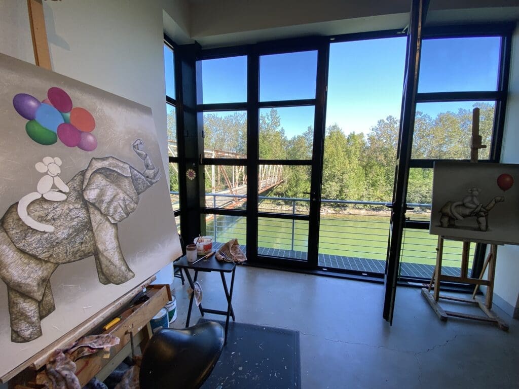
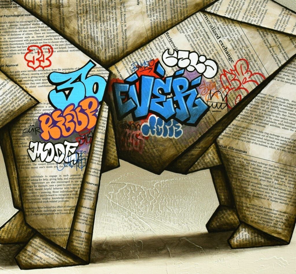
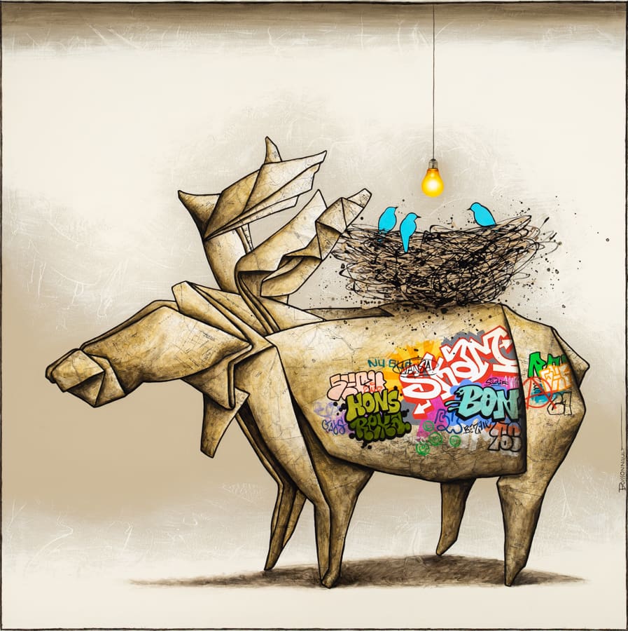
Symbolism is an important aspect in Nathalie Boissonnault’s narrative and playful pieces. Masterfully weaving together acrylic paintings with collaged maps and text, she explores broad human emotions and ideas through intimate interactions between animals. See inside her riverside Quebec studio space, and hear more about the motifs that repeat throughout her work.
What inspired you to work in collage? How do you choose your materials?
The basis for creating origami is paper, so that’s what prompted me to use paper collage to represent my origami animals. As a collage I generally choose geographical or topographic maps to evoke travel or belonging to a place, and in some cases I will favor texts whose subject will have a link with the title of the work or what I am trying to express through the work.
As for the choice to make my animals look like origami, I didn’t want to paint realistic animals. Origami and balloon animals bring an atmosphere of lightness and a playful character that leave more room for the imagination.
Can you tell us about some of the symbolism found throughout your work?
GRAFFITI In general, the graffiti that I paint are rather abstract symbols, a bit like those that can be seen on public surfaces. They always represent a certain chaos without too much meaning. On the other hand, they can reveal a lot about the environment in which they find themselves. In this sense, all the graffiti painted on my animal-origami suggest (a bit like tattoos) the course of life – the experiences, the joys and the wounds that shape individuals throughout their lives.
BALLOONS Heart-shaped balloons of course represent love, a single balloon in a work can represent friendship, sharing or a feeling of lightness and freedom. When there are several balloons, often it symbolizes hope.
LIGHTBULBS The light bulb always has a positive meaning in my works. It represents light and symbolizes audacity, determination, future and hope.
BLUE BIRDS Lightness, happiness, peace, friendship, fragility. They are little guardian angels or fragile little beings who need to be taken care of.
There are many animals that you have used as subjects time and time again —elephants, bears, and dogs, for example. Do any of the animals have special meanings to you?
There are of course certain evocations: the bear = strength, the elephant = wisdom, the dog = friendship, etc. But beyond these symbols, there is more of a transposition of human emotions through these origami animals and balloon animals. In some works I explore relationships of love, friendship, or cooperation through individuals of different species, shapes, natures and colors (origins, languages, ethnicities, colors).
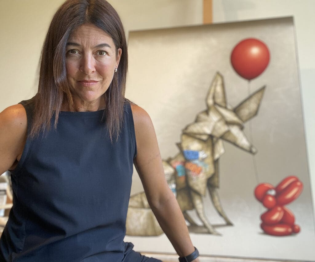
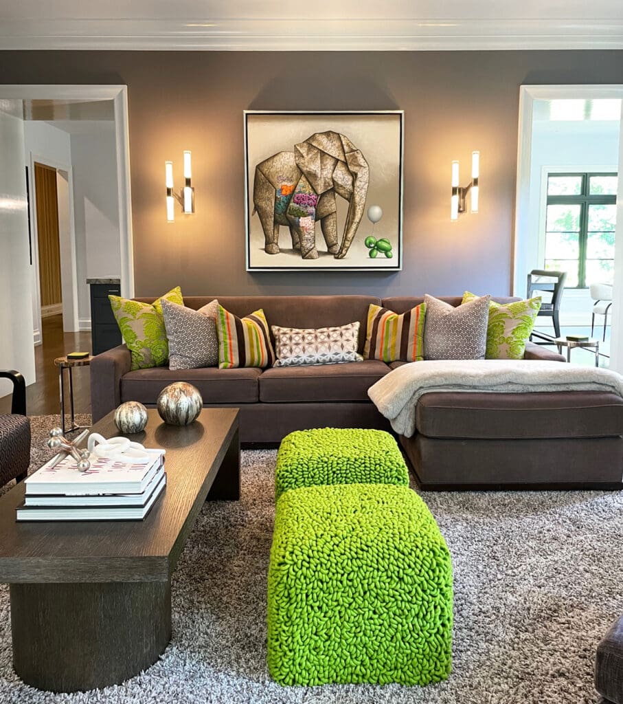
Place artwork as focal point in your living room to create drama, add color, and express your individual style. Here are five new install shots to give you some ideas, whether your living space is traditional, contemporary, or eclectic.
John Brandon Sills, Morning Radiance, oil on canvas, 30 x 60 inches
Sills’ panoramic landscape brings its calming presence to this bright and cheerful space.
George Charriez, Wrapped Up, Hand Embellished Giclee, 50 x 40 inches
Through his intricate paintings, George Charriez illustrates modern perceptions of the human condition, and he paints to inspire dialogue with his artistic commentary. Connecting to his viewer is key to Charriez. He chooses figures that are easily relatable in today’s society. Body language also plays into the concept of each piece. Strong, confident stances are prevalent.
Deriving inspiration from his artistic family, Charriez was focused on drawing and painting everything he saw around him from the time he was a young boy. He studied at Savannah College of Art & Design, after which he transferred to the Pratt Institute in Brooklyn, NY. The diversity of the Pratt campus exhilarated and inspired Charriez, and he studied and experimented with multiple modalities which he still employs in his painting today.
George Charriez, The Gift, Hand Embellished Giclee, 50 x 40 inches
After studying Illustration and Communications Design from Pratt, he worked as an illustrator and industrial designer in NY. Being involved in major campaigns and developing a great degree of proficiency in precise detailed techniques have positively informed and impacted his artistic career.
His paintings continue to be exhibited in multiple art fairs both nationally and internationally, and he has gained great attention and success over the past decades. Charriez paints every day and continues to create new imagery and explore deep ideas in his studio in Atlanta, Georgia.
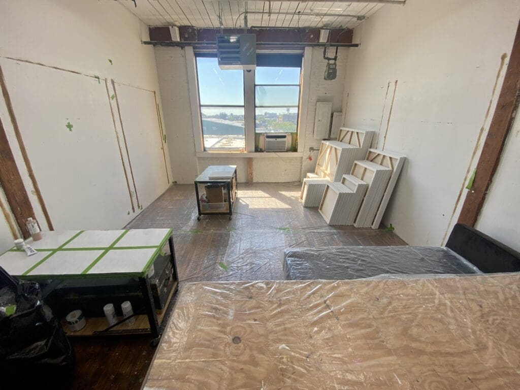
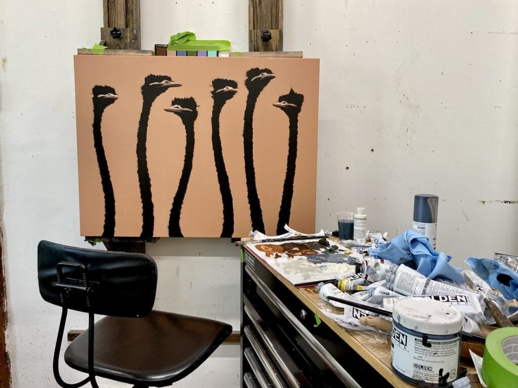
When he isn’t traveling the world, Josh Brown can be found hard at work in his New York City studio. Learn more about his creative process and inspiration in our interview below.
Birds on Jungle, oil and acrylic on canvas, 60 x 60 inches
Tell us about your background. When did you start creating art?
I have created art from the day I could hold an instrument. By 3-4 years of age, I had an understanding of proportion and perspective. Drawing and sculpture have always come very naturally to me. And of course, many thousands of hours of practice have certainly helped to develop my skill and style.
At around 17 I presented my first works for sale in a gallery setting. My first gallery work was sold the day they received the painting. Funny enough I hadn’t intended to sell the work. In a rush to send example paintings to the gallery, my mom let me send a painting I had given her for Mother’s Day. With the work selling in a matter of hours, I didn’t have time to take it back. Fortunately, my mom was very happy for me and I made a new Mother’s Day work for her.
Can you describe your creative process?
My creative process often starts with a trip. I am most inspired while traveling. Many of my artworks’ textures, subjects, and approaches are the byproduct of experiences traveling the globe. For example, most of the cows I paint are from time hiking the Alps in Switzerland, many textures and colors are inspired by time in Bali viewing traditional crafts, and the idea for the night owls and birds struck me while touring Japan, specifically while meditating at the Ryōan-ji Zen garden in Kyoto. This trend of traveling and painting provides a constant flow of inspiration. I also find inspiration locally while visiting zoos and farms across the US.
I keep extensive lists of the ideas I have while traveling and dream of capturing everything in my notes with a physical construction someday. When it does come time to create work I often prepare a breadth of canvases starting with a variety of background color and texture compositions that speak to me. I typically do not have a specific subject or composition in mind when I first make these backgrounds.
After the paint dries I review the color and texture of the canvas and decide how to best make use of the background to emphasize the subject in the foreground. This way of working forces me to respond creatively to the work.
What is your studio space like, and how does it affect your process?
I am very fortunate to have a beautiful large studio in New York City. The studio has excellent natural light and I have outfitted the space with museum-quality full light spectrum lighting. It’s truly a dream to work in.
This space is set up well for me to work day or night with little compromise. I can put 100% of my focus into the work.
I also have a great sound system. I am always listening to music while painting and often play music I have heard many times over so that I’m not too distracted by new sounds during the moment of painting.
What does a typical day in the studio look like for you?
I love to work and move, so a typical day in the studio actually starts at the gym. With a background in college athletics, I find that consistent exercise helps me to stay focused and energized in the studio. After the gym, I bike to the studio and start my day along with an espresso and a moment to go over my goals for the day. I try my best to balance impromptu creativity and an organized schedule, so every day has a touch of wiggle room if I decide to focus on something unexpected.
As soon as I have wrapped my head around the day’s goals I get to work, prepping canvas, painting, photographing finished works, wiring, wrapping, emailing, etc. Each day is often very long and intense. I take few breaks and frequently skip lunch in the whirlwind of painting. I find this intensity keeps me from overthinking and helps to maintain a more instinctual application of paint. In a way, I feel the haste in which I work makes the painting authentic and honest.
My days end in two ways, either when I am too tired to keep going, or so energized that I start dancing too much to paint accurately. Years ago my work days were typically 16+ hours or so. Nowadays I have pulled back to have a slightly more reasonable work-life balance.
How do you describe your work?
I would describe my work as an expression of joyful curiosity through animal messengers. My works are lighthearted and friendly, but I think that at a deeper level they fulfill a natural desire to be seen, loved, accepted, and celebrated. I think of my paintings as the family dog that rejoices every time one returns from a day of work. It’s a simple gesture that ceaselessly warms the heart.
I believe this is why my paintings are so readily collected. I wish for nothing but the greatest happiness for anyone who experiences my heartfelt artwork.
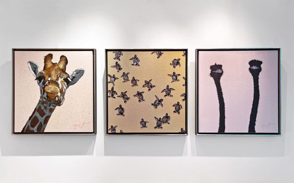
Giraffe 3, Sea Turtles 1, and Two Ostrich, oil and acrylic on canvas, 24 x 24 inches each
How has your work evolved over the years?
My breadth of subject and application has expanded over the years. It has been exciting to paint new animals, and new stories, and explore a world of color and texture. I see ceaseless potential in the works I am painting and planning. At the same time, I am very happy to know that animals and themes I worked on over a decade ago still make their way into my current paintings.
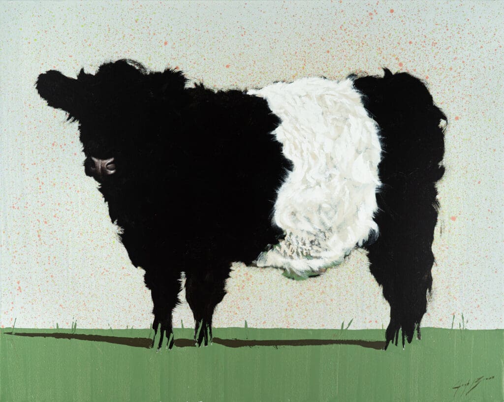
Belted Galloway, oil and acrylic on canvas, 48 x 60 inches
What’s your favorite thing to do when you’re not painting?
I have a few. I enjoy long runs and cycling trips. I will often go on a run or ride to turn my mind off for a moment.
After spending some time in Japan I’ve found an interest in the art of Bonsai. I’m certainly far from a green thumb and simply doing my best to keep plants alive at the moment!
Above everything else, I enjoy spending time with my wife and our pup. We travel frequently, love to enjoy great food, and spend time with good friends.
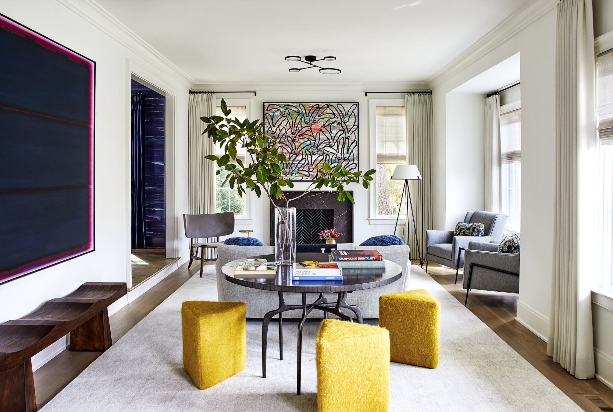
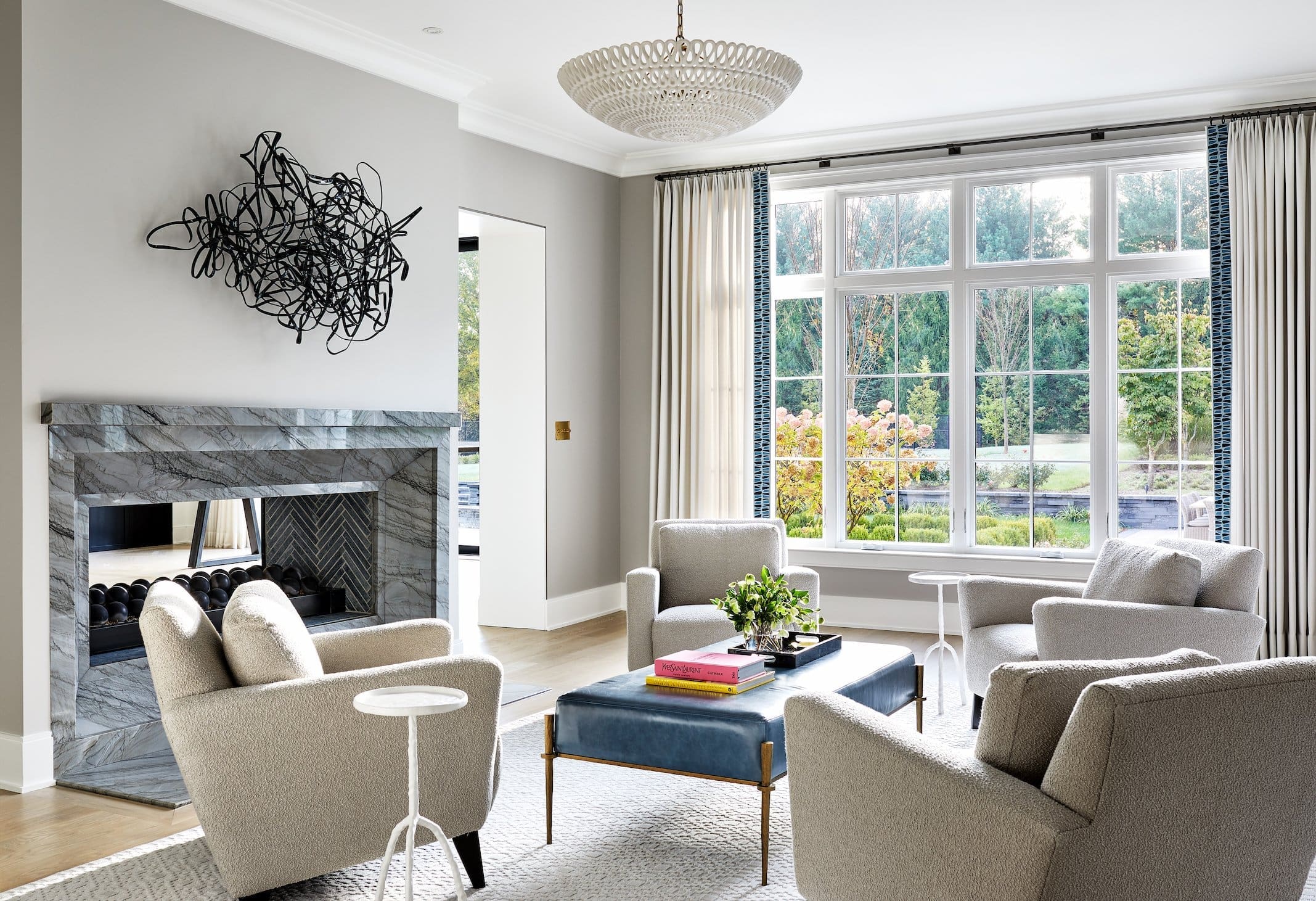
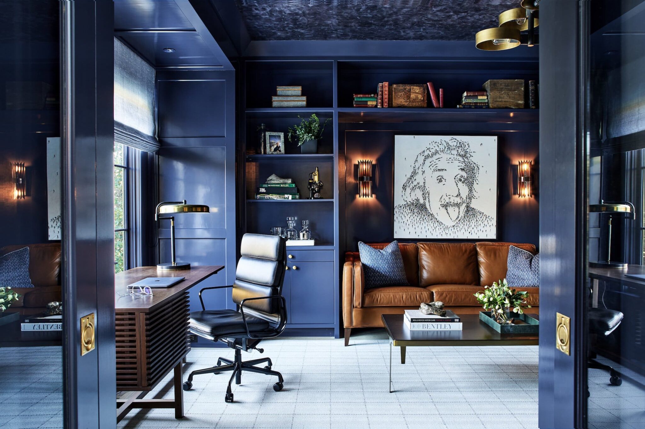
We had the opportunity to work with Washington DC based designer Erica Burns on an amazing home renovation project in Potomac, MD. Erica and her clients chose a varied selection of pieces from our gallery, creating a unique personal art collection that complements the stunning new design.
Take a look at this gorgeous home, photographed by Stacy Zarin Goldberg, and hear from Erica about the art selection process.
“For this renovation project, the clients wanted a fresh, modern feel. To achieve this, we kept the walls a crisp white in most of the house and worked with Merritt Gallery to find statement pieces in all styles and mediums.”
Matt Devine’s cassette-tape inspired sculpture adds dimension to the airy sitting room.
“We used a mix of styles and mediums, from abstract photos to photography to sculpture, so around every corner there is something new and interesting, which really makes the house such an experience to discover. It all feels sophisticated yet fun at the same time.”
A special piece by Craig Alan was commissioned for the clients’ study.
“We loved being able to commission some special pieces for our client’s study as well, which really gave the space some whimsy and personality. The Einstein commission by Craig Alan was a great way to bring in our client’s background in science and incorporate all the things he loved through the individual elements.”
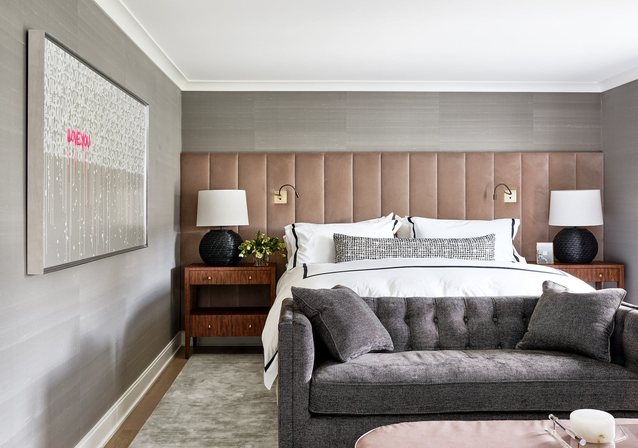
An Amber Goldhammer painting adds a touch of vibrant color and some modern romance to the primary bedroom.
“It’s so nice to work with Merritt, a local gallery, as we are able to bring in pieces to the space ahead of time. This is so helpful for our clients to really understand how a great piece of art can change the space and bring it to life, without the commitment of purchasing it first.”
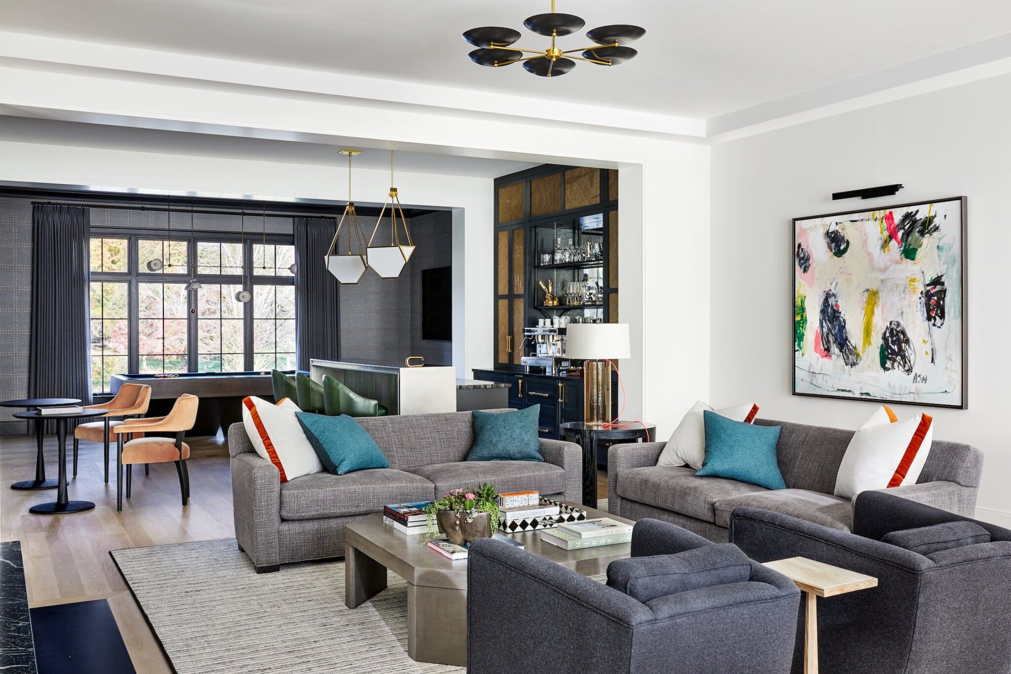
This abstract piece by Ashley Andrews is perfect for the cheerful family room.
 My role as an art consultant in the Haverford gallery is to educate and advise clients about the art, the artists, and how art will work in their homes or businesses. I feel the more background and detail a viewer has about a work of art, the more they will understand and appreciate what they are viewing. The consultants are the connection between the artist/art and the client.
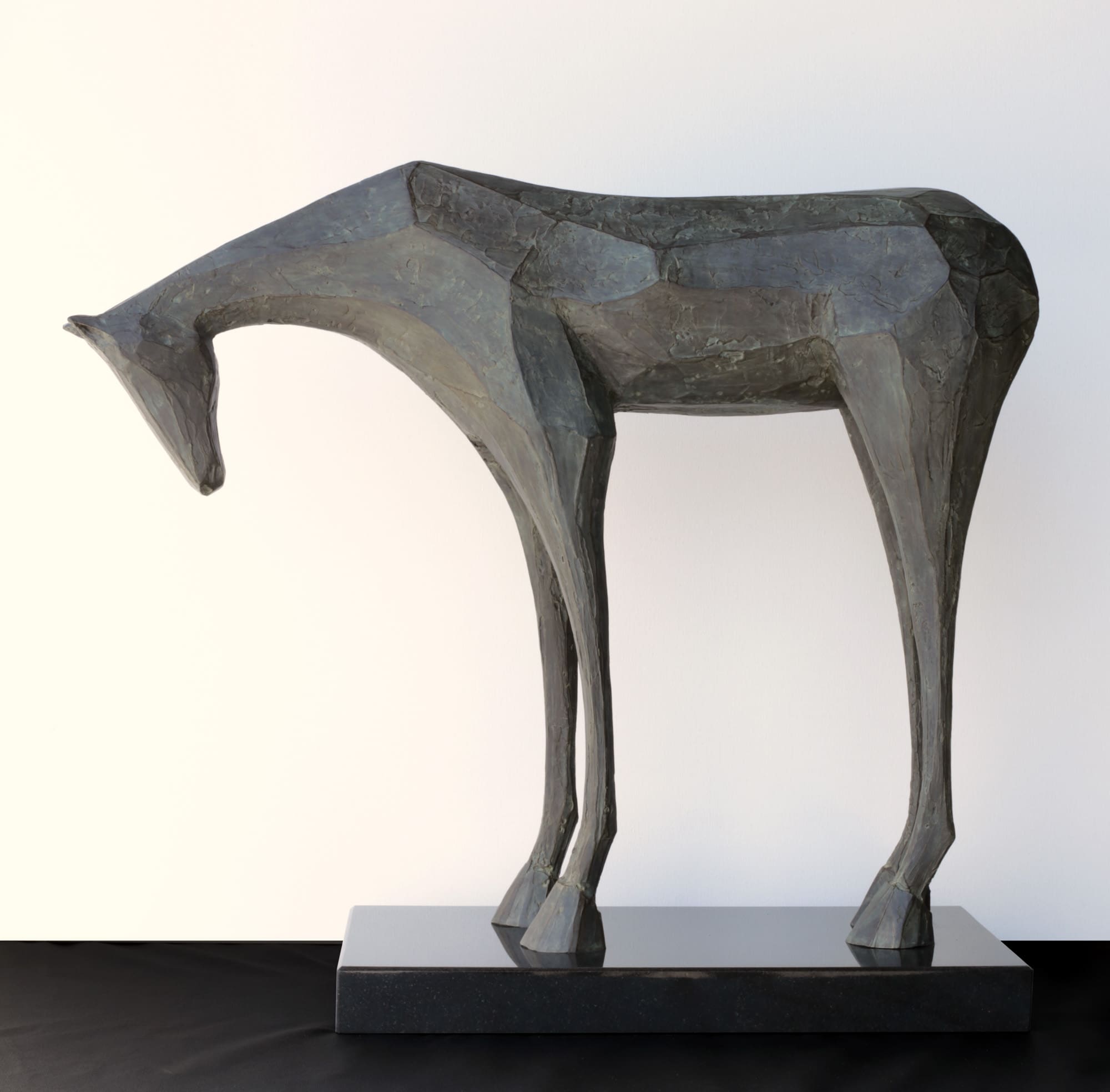 JD Hansen, Solo, Bronze, 28 x 32 x 11 inches
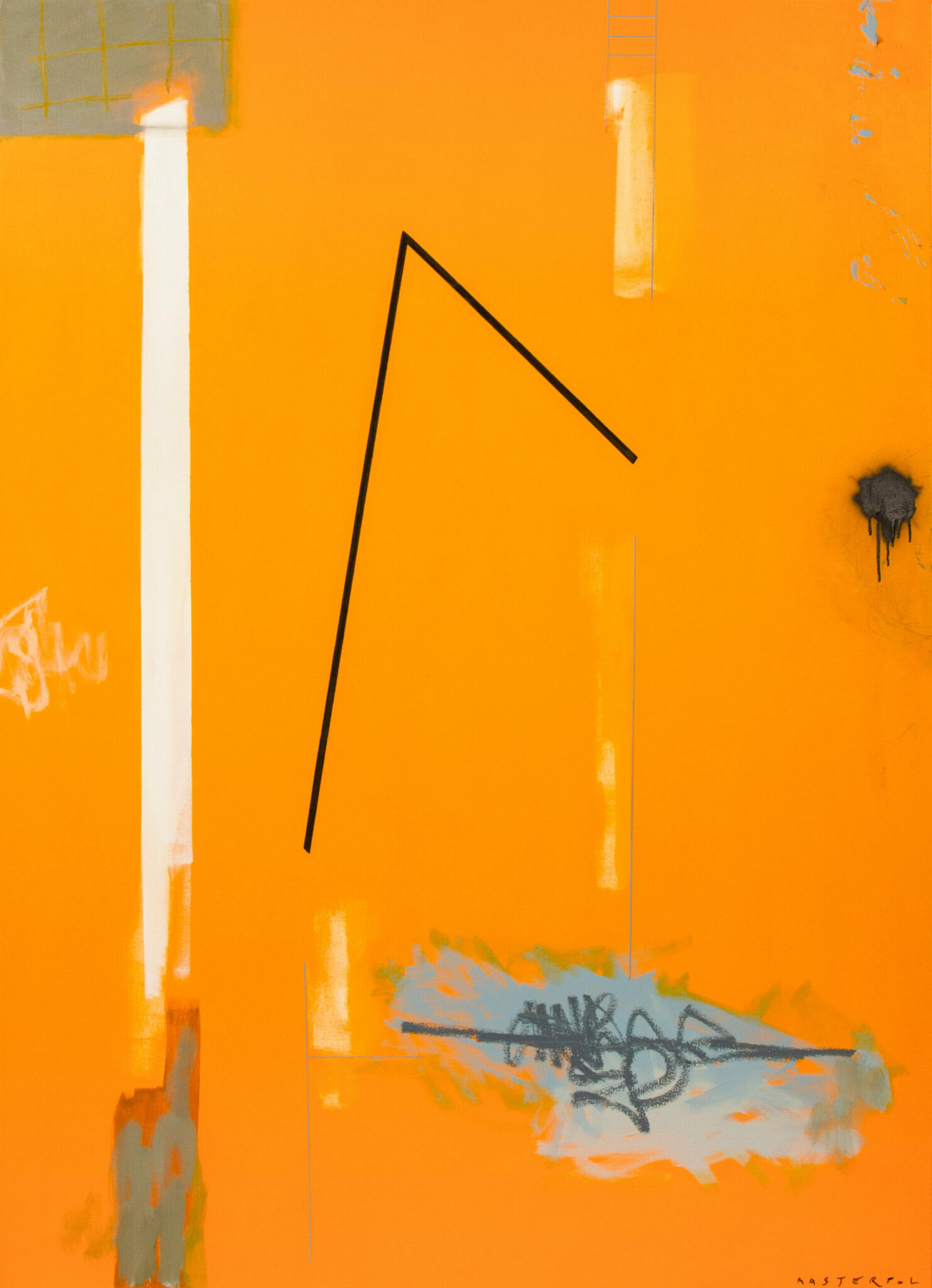


 Therrien (@rocktherrien)